Designing for accessibility is all about accounting for the needs of your website visitors and ensuring that each person can get the information they need most out of it. This means being considerate of people of all abilities, not just an idealized or homogenized focus group. Today, it’s important to make your site usable and understandable by everyone, including people with disabilities and sometimes people from different countries or cultures. Designing and building your site with accessibility in mind is fundamental to crafting better, more satisfying experiences for everyone. In this three-part series, we will examine some common web accessibility concerns and suggest ways to address them through understanding user needs. We'll start by discussing the role of color: a design element that is indispensable but presents unique challenges for digital designers.

Designing for Accessibility and Inclusion Part 1: Color
Accessibility and Color
The use of color plays a very important role in shaping a website design. Colors are evocative of ideals, can elicit strong emotional responses, and are used to visually reinforce on-screen guides and systems. They also help establish a brand's identity and message, adding subtle influence to a user's perception of your company.
However, the incredible power of color is diminished when a person perceives colors differently or not at all. Approximately 1 in 12 men and 1 in 200 women experience color blindness in some form, with Deuteranopia (red-green color blindness) being the most common. This means that inclusivity requires creative thinking about how to apply color to your design as well as how differences in ability can affect that perception.
In addition to these difficulties with universal color perception, color meaning can also differ drastically for international audiences. For example, in western cultures, it’s generally accepted that the color red represents a negative trend and the color green represents a positive one, but the opposite is true in Eastern cultures. Depending on the audience for your website, the selection of color can result in confusing messaging and visual cues for users abroad.

An Interesting Option: Non-color Markers
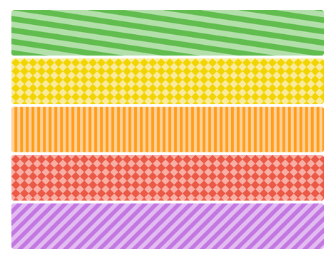
Because colors and their meanings can be lost or misunderstood through cultural differences or color blindness, non-color markers are one good way to increase user understanding. The application of text descriptions and icons works well to bridge cultural differences, and the strategic use of patterns can help people with color blindness to distinguish between colors.
This image, from wearecolorblind.com, is an example of how the productivity software company Trello uses patterning in their “Color Blind Mode” to help users distinguish between colors.
The Role of Contrast
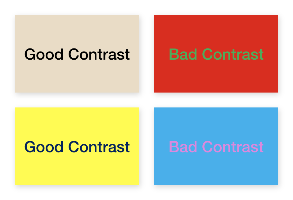
Low contrast and poor contrast between foreground and background colors also create challenges for users. Contrasting colors can be hard to distinguish for people with low vision, those who have outdated screens, or for users who are simply standing in direct sunlight. To this extent, all text, focus indicators, and icons should meet a minimum contrast ratio of 4.5:1 for people using a keyboard.

In seeming contradiction, high contrast colors, oversaturated colors, and even just the color yellow can be troubling for some people - especially people on the autistic spectrum. That said, it’s best to steer clear of the abundant use of loud, super-saturated colors. The selection of such colors makes it difficult for all users to digest information comfortably, but affects people with visual sensitivities most of all.
The Bottom Line: Color and Contrast Matter
Far from being frivolous, color has a huge impact on a design. The thoughtful application of color will strengthen your company's brand and messaging. It also provides important visual cues and system guidance for your users. Going an extra step to include deliberate - and possibly alternate - selections that consider accessibility can only help make your design more creative and usable for all of your customers. By increasing contrast and adding non-color markers, you can leave a lasting impression on your website visitors.
Check out our other articles in this three part series to get a handle on additional website design elements. Part two focuses on font selections and legibility and part three discusses the need for easy-to-use website controls.


