Data Driven Design icon

Designing for Accessibility and Inclusion Part 2: Font

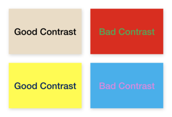
As we discussed in depth in our first article in this series, designing for accessibility is about accounting for the needs of all of your website visitors. In part one we described a variety of accessibility challenges including color perception due to color-blindness and cultural meanings of colors. We also talked about the ideal color contrast ratio to maximize understanding and legibility.

In part two we'll discuss another major factor in website usability: font selection and usage.

A Brief History of Web Fonts

When the internet was still relatively new, web pages were designed with fonts ranging in size from 9 to 14 pixels. This worked out alright at the time because at-home screen resolutions were relatively low compared to what we’re used to today. Website pages were designed with the understanding that browser windows fit neatly into a standard set of parameters. In addition, the early years of the internet brought limited layout options and font selections, making it difficult to accommodate user needs without special equipment such as a screen reader.

Suffice it to say, things have changed considerably, especially in the last 20 years. Web browsing now takes place on all sorts of devices with wildly different screen resolutions and sizes. Today, people still routinely use early generation smartphones, increasingly use tablets and smartwatches, and display presentations to large groups on huge 4k (or more) displays. The incredible expansion of screen sizes and resolutions means that font usage standards have also had to adapt. Because fonts are a fixed number of pixels, as screen resolutions have increased, the physical area taken by those pixels has decreased, making the font look smaller overall. This means that website designers and developers can no longer use fixed font sizes across the web.

The Solution: Responsive Font Sizes

Instead, digital designers and web developers have had to make fonts as responsive as the design itself. Most modern website design is responsive to screen size, meaning that the same website transitions seamlessly as the browsing screen size changes. Developers can leverage responsive frameworks such as Bootstrap, as well as media queries to modify font sizes for legibility. In addition to supporting responsive font sizes across screen sizes, browser settings now make it possible to allow users to customize the line height and letter spacing on the page to provide a more comfortable reading experience.

Additional Considerations: Font Style

Font style is an important factor in improving legibility - and therefore, accessibility. For example, cursive or decorative font styles are much harder to read for many people. People who are dyslexic have an even harder time with these fonts, making them less desirable for use today. Additionally, several other factors impact legibility. Italicized text, small font sizes, and using an all uppercase font make it more difficult to read the information on your website. Uninformed font choices can also lead to accessibility problems for older people.

Here are some examples of ways to use fonts that are easily readable vs. difficult to read.

In general, larger font sizes, taller line heights, increased letter spacing, and shorter line lengths help everyone have a better reading experience. An experienced designer knows this and can help design your website and other digital assets appropriately.

The Bottom Line: Choose Fonts Wisely and Style for Legibility

Adept digital designers know the importance of choosing the right fonts and making them highly legible for your audience. A few key adjustments during design can improve your website drastically. Use the power of responsive design to appropriately size fonts for your users across screen sizes. Select fonts that are easy to read and avoid cursive and overly decorative fonts. Limit the width of text blocks and adjust line-height to maximize easy reading. Even if your website doesn't need to accommodate large numbers of people with disabilities, adhering to these guidelines will increase accessibility and inclusion for all of your customers.

Check out our other articles in this three-part series to get a handle on other important accessibility considerations. Part one explains some of the challenges with color and cotrast and legibility and part three discusses the need for easy-to-use website controls.

Looking for design expertise?
Contact Us