It takes more than an old-fashioned, pre-made website to achieve success online today. One of the main changes over recent years has been the rise of the mobile web, and it's essential that your online presence takes this into account. Here are seven strong reasons why.

Why a Mobile-Friendly Website is an Online Business Essential
It's an established statistic that more than half of web traffic now comes via mobile devices. And while these devices do a great job of displaying almost any website, if your pages aren't optimized for small screens, you're likely to be needlessly throwing traffic away.
No website can be truly successful if it rejects half of its potential customers and gives them a poor experience.
Giving your mobile visitors a better experience isn't just good for sales. If your site falls apart on a mobile device, most visitors are going to quickly leave rather than persevering.
This raises your bounce rate and lowers your overall engagement figures. Over time, these effects will feed through into reduced rankings on Google. Your traffic will slowly dwindle and eventually die.
A sleek website that's optimized for small screens and non-optimal data rates will be faster loading than one that's bloated and unwieldy. Page load speed is recognized as an important Google ranking factor, and so it's vital to make your site as lean and mean as you can.
Although it can be a major project to convert a website into a mobile-friendly format, it's essentially a one-off effort. When you use correct responsive design techniques, your website will work perfectly on any modern device, and will continue to do so for the foreseeable future.
You won't need to constantly redesign it to keep up with technological changes, and if you use a responsive design you won't need to maintain several site designs in parallel to work across the whole device landscape.
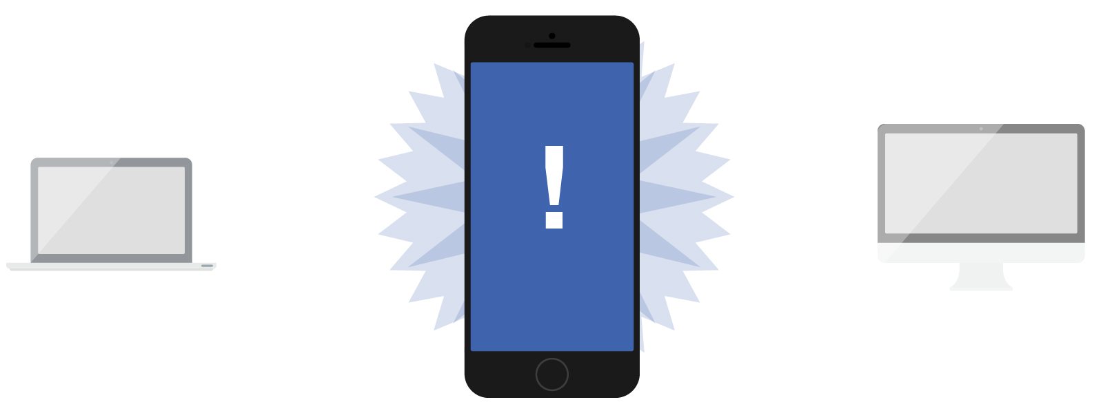
Compatibility with multiple devices works to boost conversions too. Many mobile users research purchases while commuting or relaxing, and then later move to their desktop or laptop to complete the transaction.
If your website doesn't work well across devices, this common buying journey will be made less satisfying, or even blocked altogether.
Social media accounts for a vast proportion of online activity, and much of this is carried out on the go using smartphones and tablets. If you want to appeal to these users, you need to make the transition from their favorite social media platform to your website seamless, and this means perfecting your mobile design.
Finally, optimizing a website for mobile forces you to make tough choices. You need to strip out unneeded elements to reduce load times. You need to make navigation crystal clear, and to ensure your marketing is as compelling as possible. All this adds up to a stronger, better performing site in commercial terms, boosting sales and profits.

The days of a simple, off-the-shelf website are over if you want to make the most of the opportunities offered by modern online business. By making your company's site fit every device, you'll be making it easy for your website to give you a great return on your investment.
Is your website ready
for mobile users?
We can help
Recommended content: