No matter what industry your business is in, it should come as no surprise that many of your website visitors and potential customers are reaching your website via a smartphone, tablet, or another mobile device. Gone are the days of sitting down at a big, heavy desktop computer and typing in a search. Mobile is here, and it is here to stay!

Why Should You Switch to a Mobile-First Website?
Do I need to change my business website?
Maybe. It depends how your website is built.
Years ago, the industry-standard was the creation of two separate website experiences - one designed and built for larger desktop displays and one for mobile devices or apps. Advancements in responsiveness changed this concept. Now, you can build a single website and make it responsive to every device and have a better user experience. It's often quicker, easier and better for everyone involved! Google is anxious to make the internet a user-friendly place and mobile-first indexing is a major step in the right direction. Google has announced it considers the mobile-friendliness of your WordPress website as a ranking factor. What does this mean exactly? The mobile version of the website becomes the main version of your website. This isn't a movement you want to miss out on.
To put it plainly, there are a lot of people on their phones and other devices. Over the past few years, the use of mobile phones has forced a sharp decrease in desktop traffic for many websites. Today's users surf the internet using their mobile devices while on the go or even on their couch at home. For this reason, the user experience for those on a mobile device is really important. The changes in user behavior haven't gone unnoticed by the tech giant, Google. That’s why they decided to change its search engine index settings to a mobile-first index.
Due to the increase in mobile traffic over the past several years, Google changed its index policy. Before, the desktop version of a website would index first on Google. Now, Google has changed it to mobile-first index. This means that Google crawlers will crawl through mobile versions first, then rank and index on Google's Search Engine Results Pages (SERPs) based on the mobile versions. This change can have a huge effect on your business's SEO and organic rankings because the desktop experience of your website will no longer help your rankings as much. If your website was built with a desktop-first approach, the experience of your mobile users may not have been well designed. If you have a bad mobile experience, then your SEO efforts will be wasted on your website.
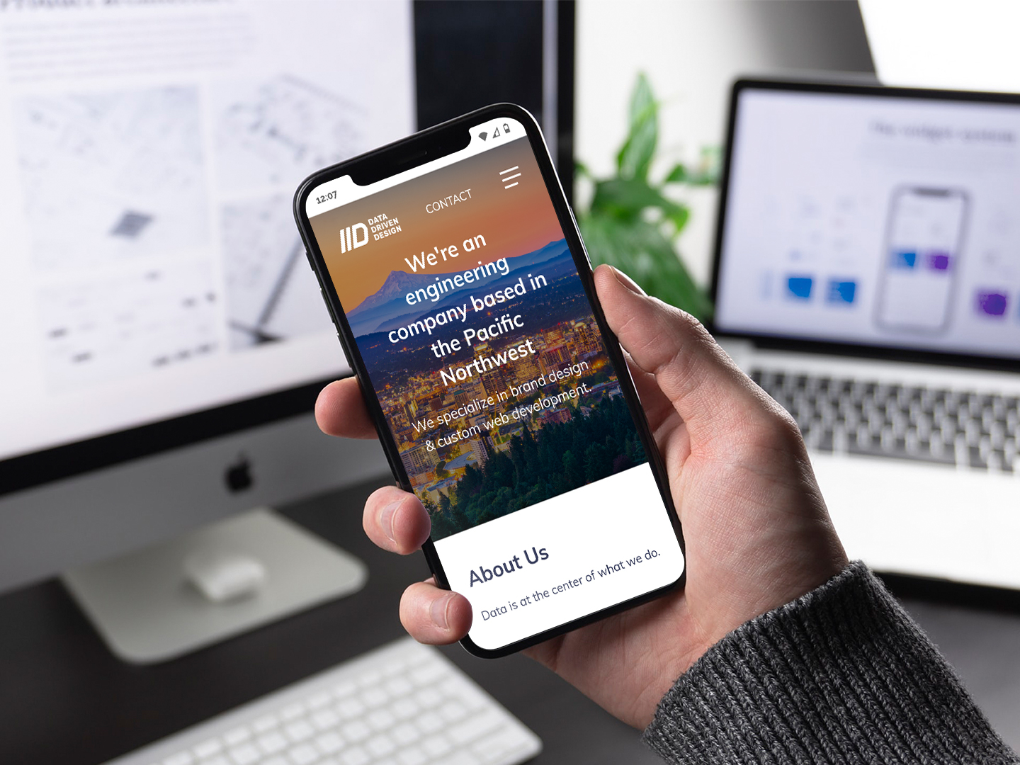
Modern users expect a modern website experience
Google changed its algorithm as user behavior changed. You need to change too! You want to grow your business. This means focusing on mobile users. If you want to rank higher in Google SERPs, you need to make your WordPress website mobile responsive. Switch to optimize the mobile-first index and increase traffic on your WordPress website!
Modern users are mostly using mobile devices than desktop to buy online or search the internet. The mobile version of the WordPress website will determine the success of your website. Data Driven Design is here to help you adapt to this change. Call us at 971-803-5350 or email [email protected] to get started working toward your goals, together.
Need help with your website?
Contact UsCRecommended content: