Technology:
Greensock
Scoll Magic
HTML/SCSS/JS
Craft CMS
Google Geolocation API
Customized version of Slick

Project:
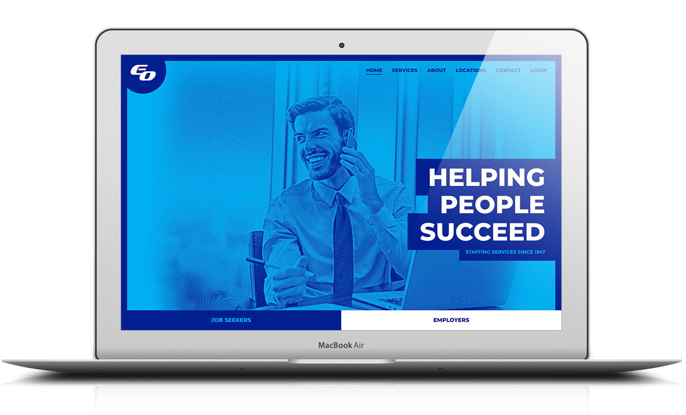
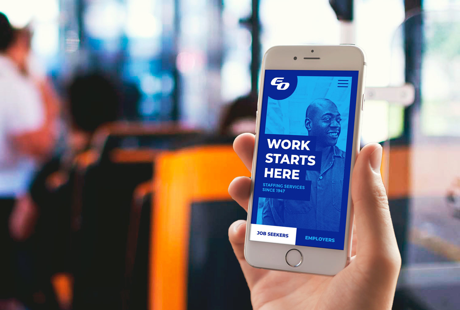
We delivered a functional website that offered a streamlined user experience for their two core audiences: Employers and Job Seekers. By creating a content toggle on each of the foundational pages of the site, Data Driven Design gave users the control to display the information that was most relevant to them.
Greensock
Scoll Magic
HTML/SCSS/JS
Craft CMS
Google Geolocation API
Customized version of Slick
Frontend Development
Backend Development
DevOps
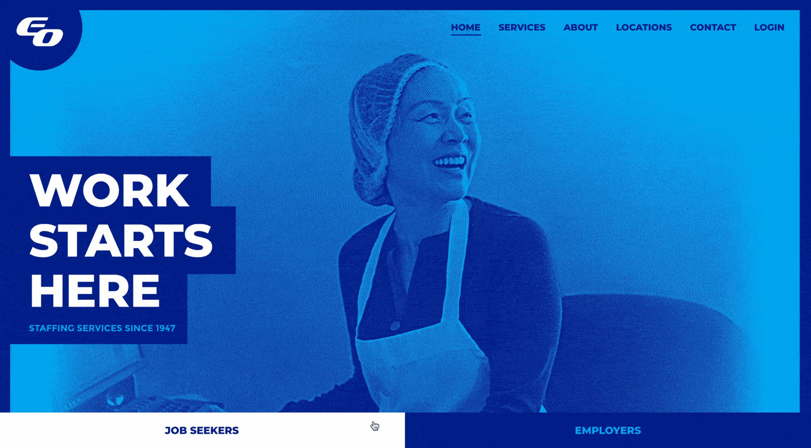
Employers Overload had a site that was long overdue for a facelift. But in re-imagining their website, they needed to include content for two equally important audiences. The design that was delivered captured this idea as pairs of pages that would be displayed using a secondary navigation - one for job seekers and another for employers - located below the hero image. Data Driven Design was asked to produce EO's website and implement this two-page system for several key pages across the site.
Because social media and SEO are tied to an individual web page on a site, it was extremely important to work out the details of the two-page system so that Employers Overload would be able to effectively share posts to social media, have their content picked up for SEO, and link directly to a page targeted to members of one group. In order to accomplish this, Data Driven Design created custom routing to detect URL fragments. On initial page load, the URL follows a standard format (for example, www.employersoverload.com/serv... ) and the page is assembled server-side, to render as quickly as possible. Instead, if you click on the content toggle, it asynchronously loads the content of the other page and uses URL fragments (such as the "?page=/employer" added to the end of the page's URL) in order to make it possible to link directly to the page's current state. This maximizes the page's SEO and social media sharing potential.
The final piece of the dual content set-up was transitioning between the employer and job seeker content smoothly, to give the impression that both pieces were part of the same page. We leveraged Javascript and CSS transitions in conjunction with asynchronously loaded content in order to achieve a page load with no visible refresh.
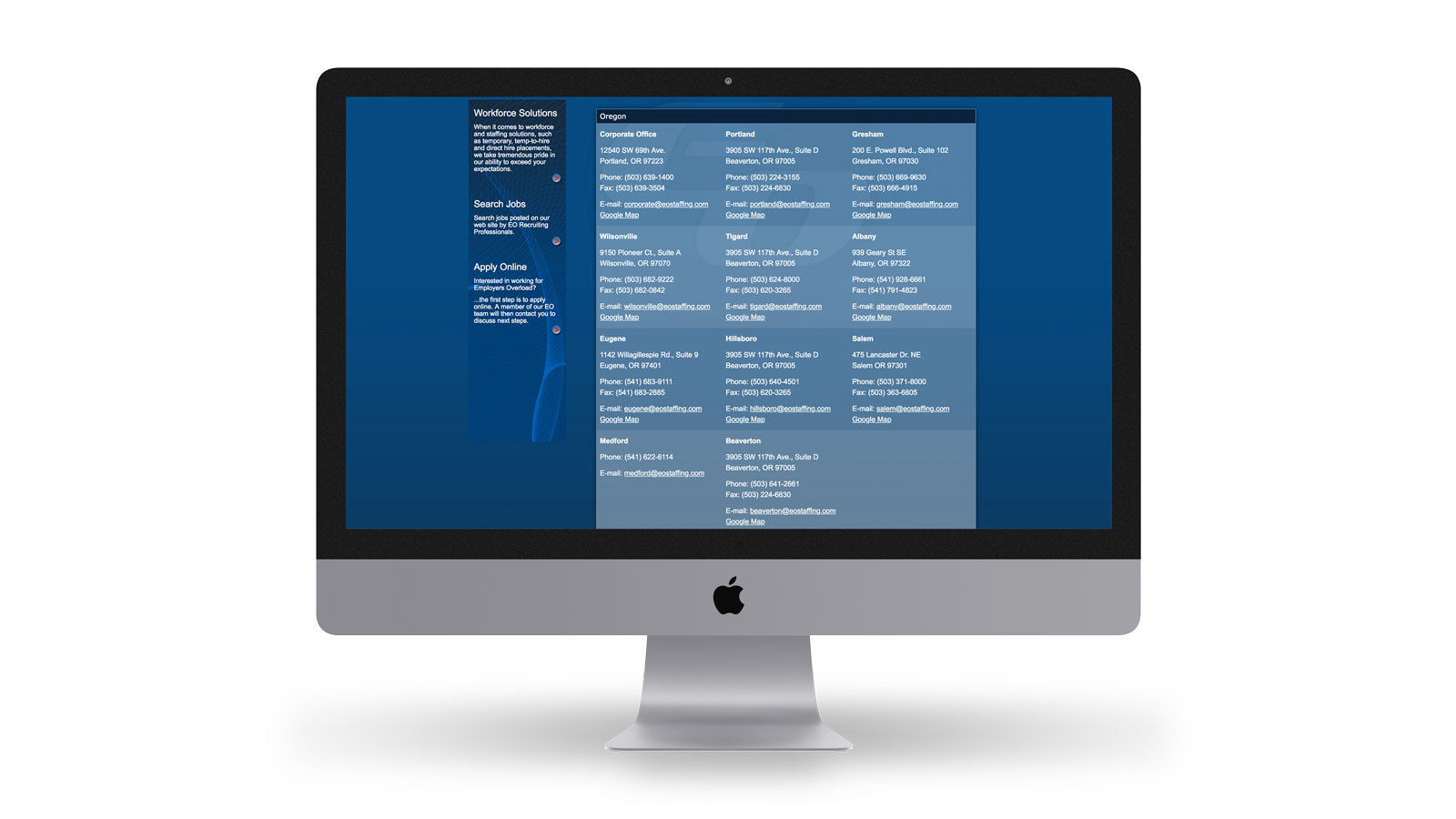
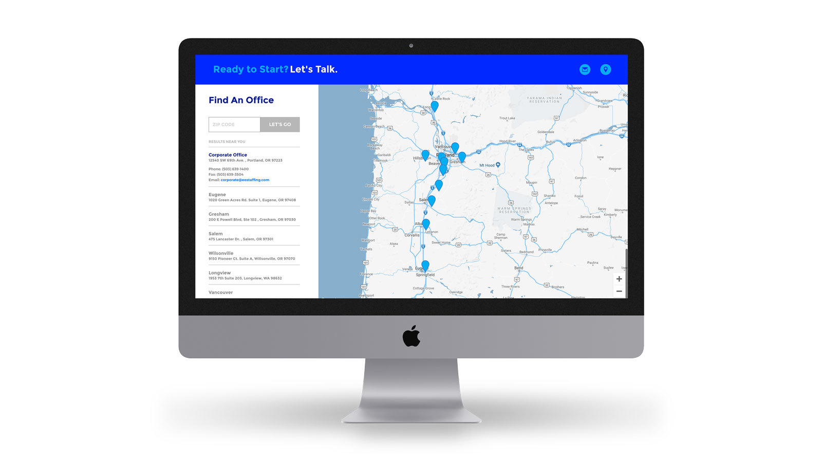
EO's business is centered on people and their contact information needed to be easily accessible for anyone who visited the site. Instead of having a separate contact page, their locations and contact form are tucked away in a "drawer" that slides out. When a visitor clicks on "locations" in the menu, they are transitioned down the page they are on and EO's locations are displayed, providing for easy access to contact details for all offices.
Data Driven Design also wrote a custom algorithm to determine a user's proximity to business locations by zip code. If a user uses the zip code search, results are ordered in the location finder and the Google map is dynamically updated without the need of leveraging third party location services. By building the office locator in this way, we were able to reduce the wait time of the end user.
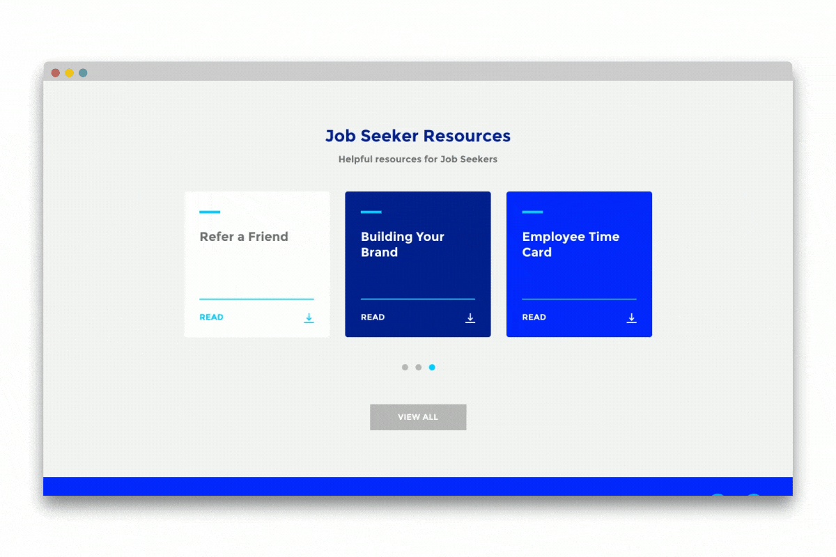
In several places across the new site, carousels were chosen to display collections of related material. On the services pages, we made sliders to display the service offerings for each audience, as well as a carousel of resources for users to browse through. In both cases, this layout transforms at desktop and was chosen to help display more content for users on mobile devices and tablets.
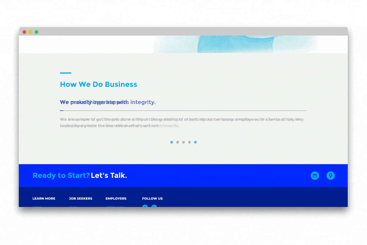
However, two other types of content needed a custom slider for all devices and screen sizes. Data Driven Design built distinctive, auto-rotating content sliders for EO's processes and values. As part of this, we modified the core functionality of the slick slider, extending it's capabilities to create a progress indicator that fills from left to right, counting down to the next slide transition.
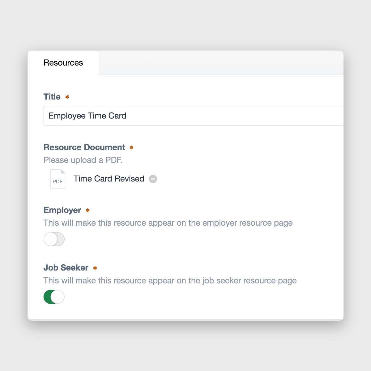
EO wanted a way to allow for sharing information with employers and job seekers. Often, these tips and tricks would be targeted at one group or the other, but Data Driven Design ensured all use cases were considered in the final content entry set-up. In Craft's backend, we set up resources in a channel and made it so that an administrator could decide whether to post to one or both pages. This made sharing each resource to the correct page(s) quick and easy.
