Technology
HTML/SCSS/JS
Craft CMS

Project:
MOVE BEND needed a partner to help drive public awareness and community engagement around how to respond to the increase in population. We were called in to create a visually-communicative website that would invite stakeholder participation across the community.
HTML/SCSS/JS
Craft CMS
Dev Ops
Frontend Development
Backend Development
Solution Architecture
The MOVE BEND coalition was started as an initiative by Bend 2030 and was tasked with creating a digital hub that would engage businesses and residents of all backgrounds and viewpoints to help keep what's special about Bend even as they grow.
Currently all major transportation groups, including the City of Bend, Cascades East Transit, the Oregon Department of Transportation, the Bend Metropolitan Planning Organization, and even Bend’s Park and Recreation District are updating their plans. There are millions of dollars on the table and MOVE BEND's mission is to include the public in the decision making of how those dollars should be spent.

MOVE BEND recognizes that the best cities in the world are finding ways to link their forward-thinking innovations through smart technology that reduces congestion and costs, increasing quality of life for all. They wanted to apply the same approach to their website.
We engineered a solution that engaged users every step of the way, creating clear visual cues and interactivity that immersed users in the experience and helped them feel like they were already a part of the process. The solution was also practical for an evolving organization - built on a platform that is easy to edit and maintain as they continue their efforts.
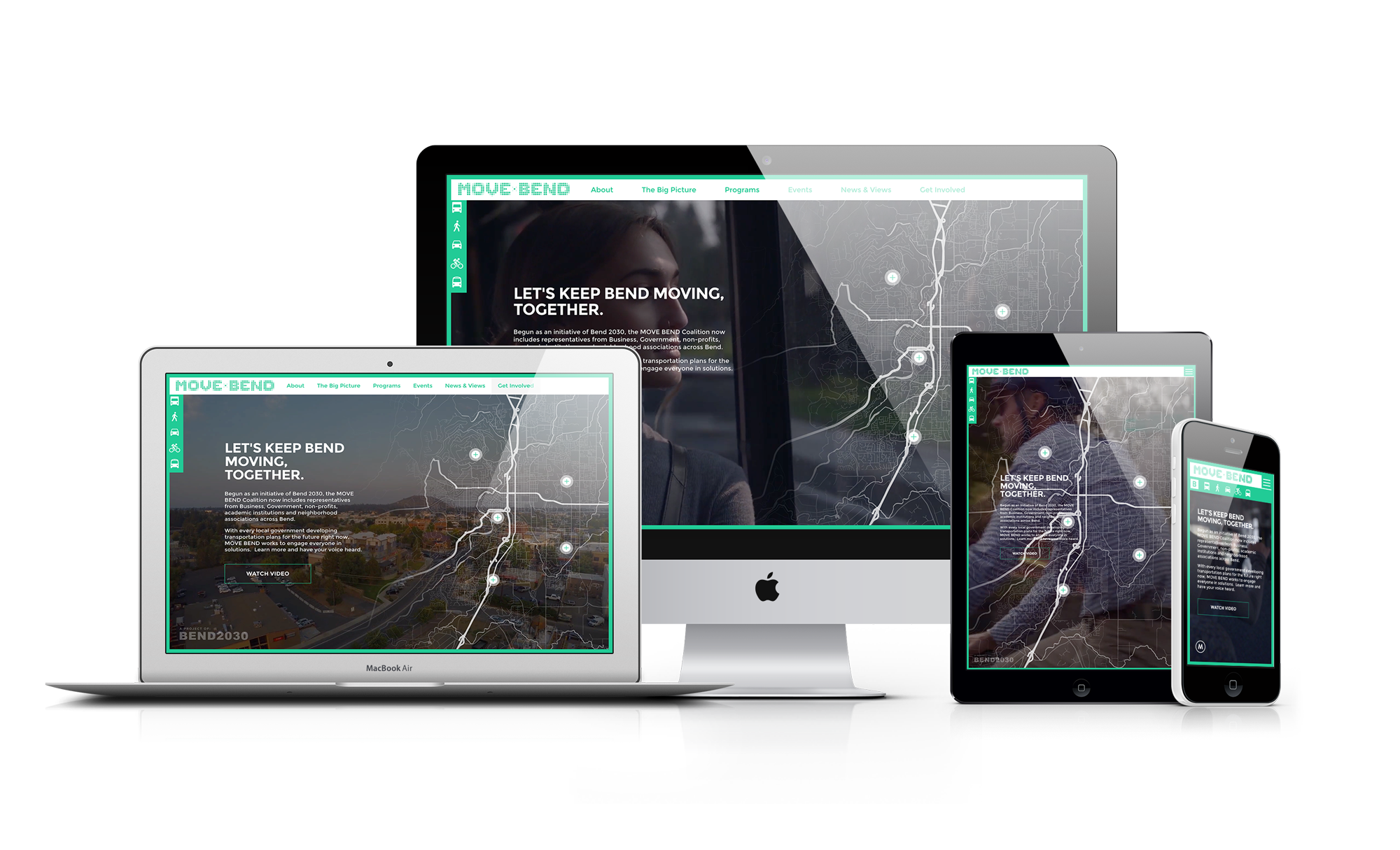
The site was built as a single page application (SPA) in order to maximize performance and opportunities for user engagement. Rather than having traditional page loads, the content was dynamically injected into the page using visually appealing loading effects and transitions. In addition, where traditional pages would normally exist for event listings, contact pages, etc, the site instead had a stacked fly-out navigation that slides in from off-screen and layers in new pages as you move through the menu. The overall effect is a site that is fast, visually interesting and fun to interact with.
The dynamic nature of the site and the fact that it was a single page application led to some technical challenges that needed to be overcome. Because there weren't individual pages, we needed a way for users to share links to specific application states. We implemented URL fragments in order to allow page state to be recreated from a link so that users could share specific application views out on their social channels.
Businesses, government, non-profits, academic institutions and neighborhood associations across Bend have come together to plan.
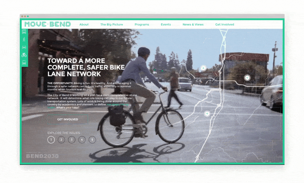
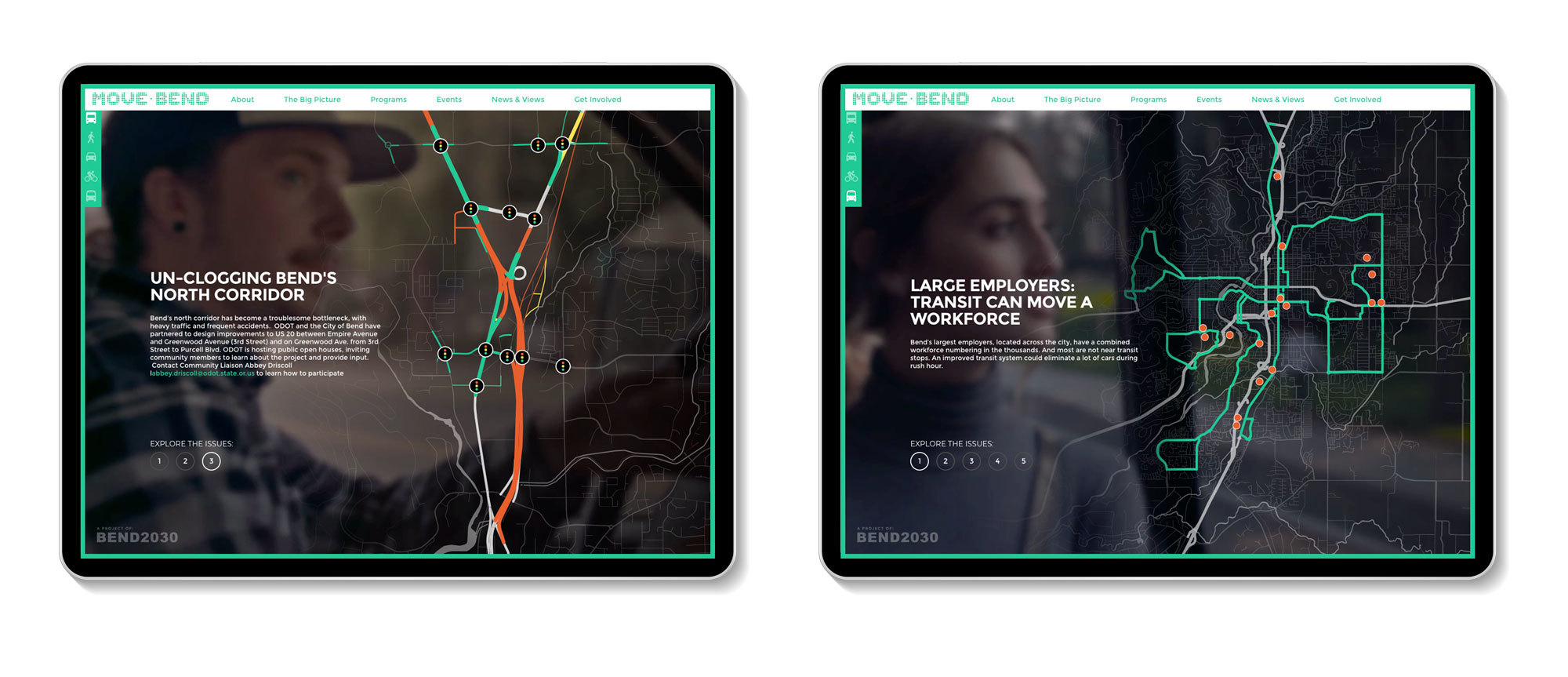
Leveraging a vector based street map of the municipal region of Bend, we applied layers of interactivity and perspective that aided MOVE BEND in communicating the anticipated impacts of various aspects of population growth on multiple modes of transportation across the city.
The addition of hotspots on these maps allows users to easily dive deeper to explore specific issues in their neighborhood. This, in turn, encourages discussion and debate over how to respond to the growth issues that are extremely relevant to their day-to-day routine.
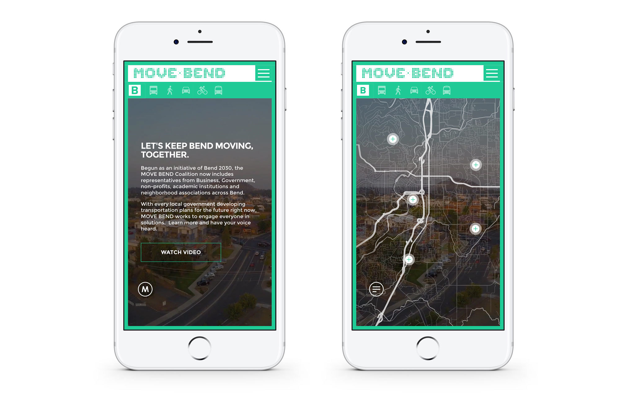
The limited screen space of mobile devices provided an additional challenge when building a website where interacting with large, detailed maps was the key focus. Data Driven Design implemented a toggle to allow users on phones to easily switch between viewing content and interactive maps. This means that regardless of device used, users can have the same, feature rich, interactive experience.
We incorporated animated SVGs into the loading sequence of the site to create a polished, engaging experience without sacrificing loading speeds to GIFs or video files.
