Technology:
Craft CMS
Bootstrap
HTML5/CSS/Javascript
Adobe XD
Adobe After Effects
Adobe Illustrator

Project:

Craft CMS
Bootstrap
HTML5/CSS/Javascript
Adobe XD
Adobe After Effects
Adobe Illustrator
Information Architecture
Web Design
Illustration
Animation
Frontend Development
Backend Development
DevOps Support
Project Management
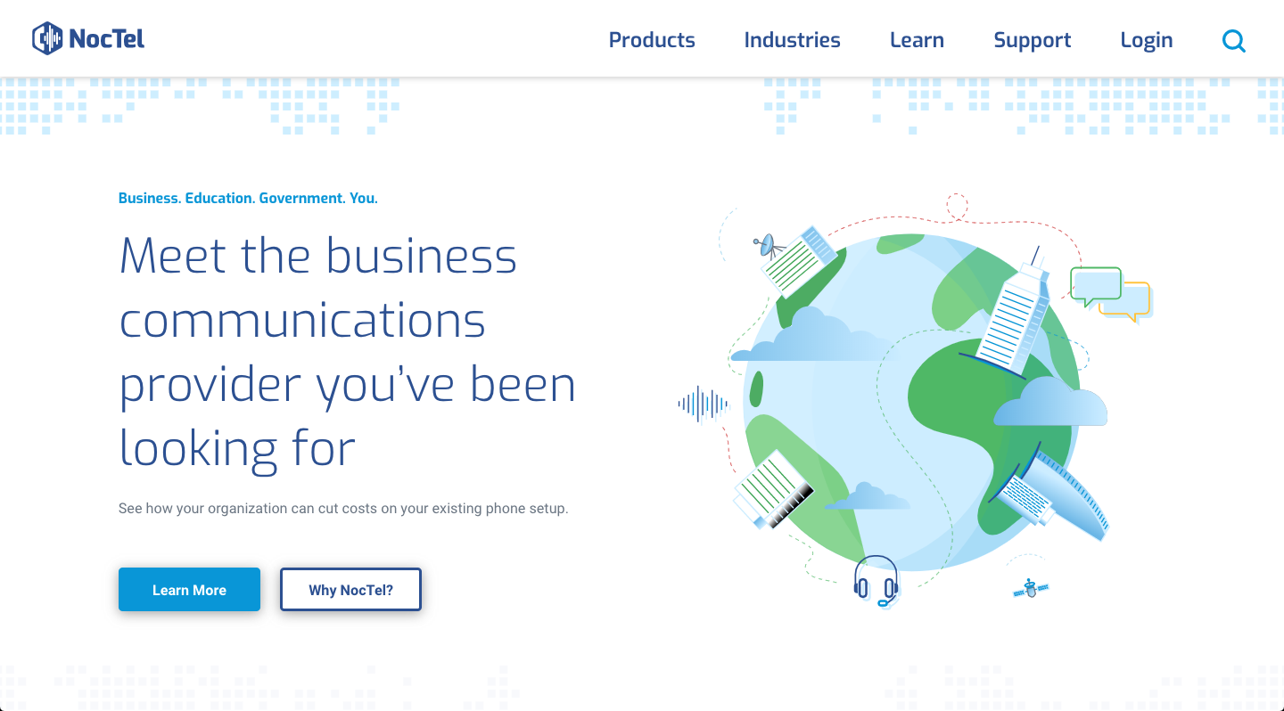
NocTel was looking for an updated, modern design for their website - one that was more in line with the quality and attention to detail that their customers experience with their services.
In addition, they were aiming to simplify and streamline their content in order to achieve a clean, "less is more" look and feel. NocTel's previous website design was text-heavy, so helping them cull extraneous content was essential in creating this aesthetic, as well as being important for the direction of their company. We wanted to leave just enough intrigue to encourage users to reach out and start a conversation with them, which was also where NocTel found the most success in closing.
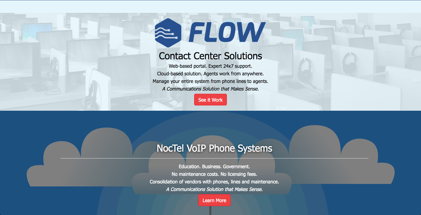
A key message for NocTel - and many companies - is communicating the company's differentiators. NocTel focuses on service and specialization to set them apart in the market. In order to align their website with their company culture and the value they bring to their customers, we added spots for NocTel to highlight the great feedback their customers have provided. These personal testimonials can be displayed prominently on their homepage and on their case studies, helping visitors build trust in their services.
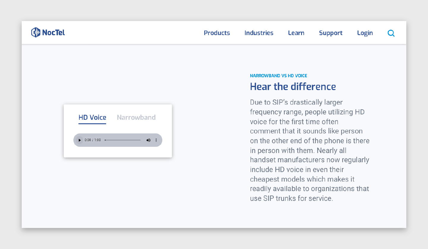
In addition to testimonials, we decked out the Why NocTel page with flexible and specialized page sections that help explain some of the important differentiators NocTel's team has built for their customers. Included in the page is a section that invites interaction by allowing potential customers to compare the audio quality of HD voice to the systems they likely have in place from many years ago.

One aspect of the previous design that we all wanted to carry over to the new site was the use of illustrations, as opposed to stock or new photographed imagery. This excited The Data Driven Design team because we love the creative interpretation illustration brings, especially when pairing it with a technical write up that can benefit from the additional context of custom imagery.
We decided to scrap all existing assets and begin again with the new creative approach defined for the site. Between the illustrations for case studies and the ones created to accompany NocTel's differentiators, we were able to create a cohesive style across the site from the UI to the content.

We even added a touch of animation to a few of the new illustrations, to bring them to life and keep the user engaged as they move through the site. We focused these efforts on prominent places across the site, such as the home page and services pages that customers are most likely to visit.


Because customer service and support is so important to Noctel, it was important to design a site that was easy to use for self-service tasks and allowed customers to quickly reach out if they were experiencing a problem. Prominently displayed on the site's header is a status indicator to provide a quick check for users. For this new feature, Data Driven Design hooked into an API that monitors NocTel's systems. In addition, the support part of their menu pointed not only to specific pages but specific sections of pages that will be needed most. These are designed to get customers to the support docs, FAQ section or contact details they need.

On the support page itself, we also included a place for NocTel to manage their product roadmap. This section helps give customers insight into features being discussed as well as the opportunity to upvote the ones they'd most like to see developed.
In search results, the page name, url and highlighted excerpt are all displayed prominently, adding greater context for users.
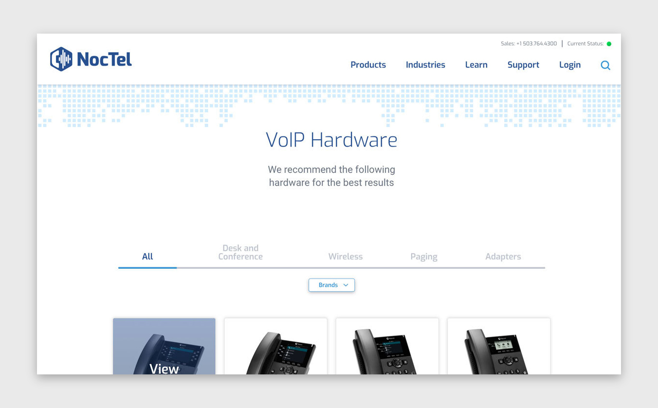
In order to keep the page flexible and useful, DDD's team designed and implemented a series of filters with different purposes. One style of filter is a more traditional dropdown that allows multiple selections for device brands. A second is meant for filtering by type of device where a user can select all or only one category. This filter is built to allow NocTel's team to add additional categories in the future but has an interesting way of displaying the "hidden" groups on smaller devices. Based on screen size, an additional menu item titled "More" holds categories that won't easily fit onto the screens if a user is on a tablet or mobile phone. We combined this idea with a slide indicator, to help users understand where their selections have been made. Although it's a creative twist on the usual filter implementations out there, the filtering itself works as a user would expect.
To create consistency in user experience, we've used these same styles of filtering on other areas of the site. The multi-select implementation translates well to help users filter blog posts by category. The hidden-slider implementation is replicated for types of partners on NocTel's About Us page.
NocTel Communications' new website was recently recognized by the Academy of Visual Arts in four categories, one of which, Platinum, is the highest level awarded in the AVA's: