Technology Used
Google Slides
Adobe XD
Sketch
Slack
Project:
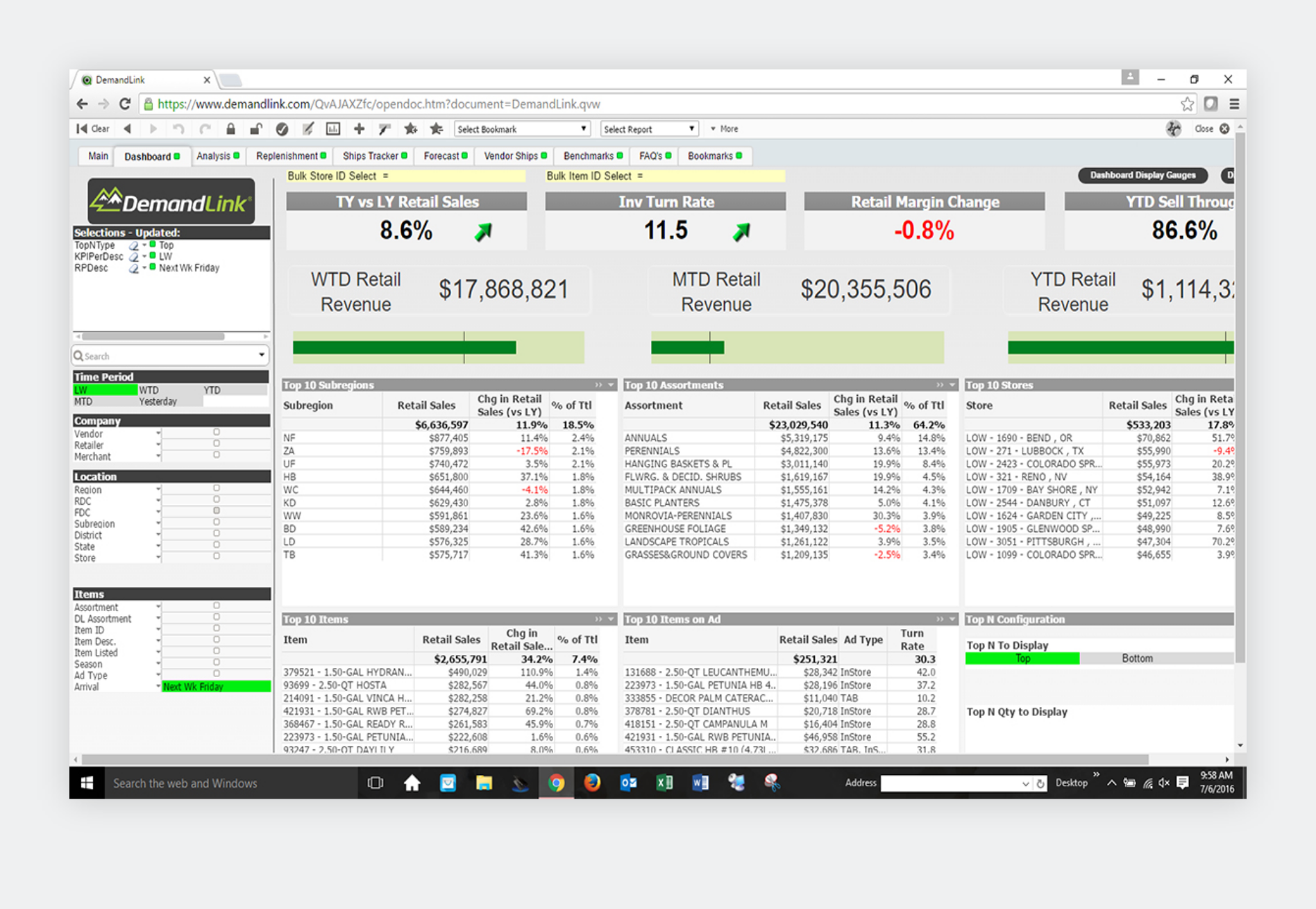
We were approached by DemandLink, an industry leader in business intelligence (BI) tools, to provide a visual redesign of the user interface for their web-based product - a dashboard that delivers accurate and actionable insights and analytics for demand planning, replenishment, and sales.
Google Slides
Adobe XD
Sketch
Slack
Creative Direction
Design
IA/UX
Project Management
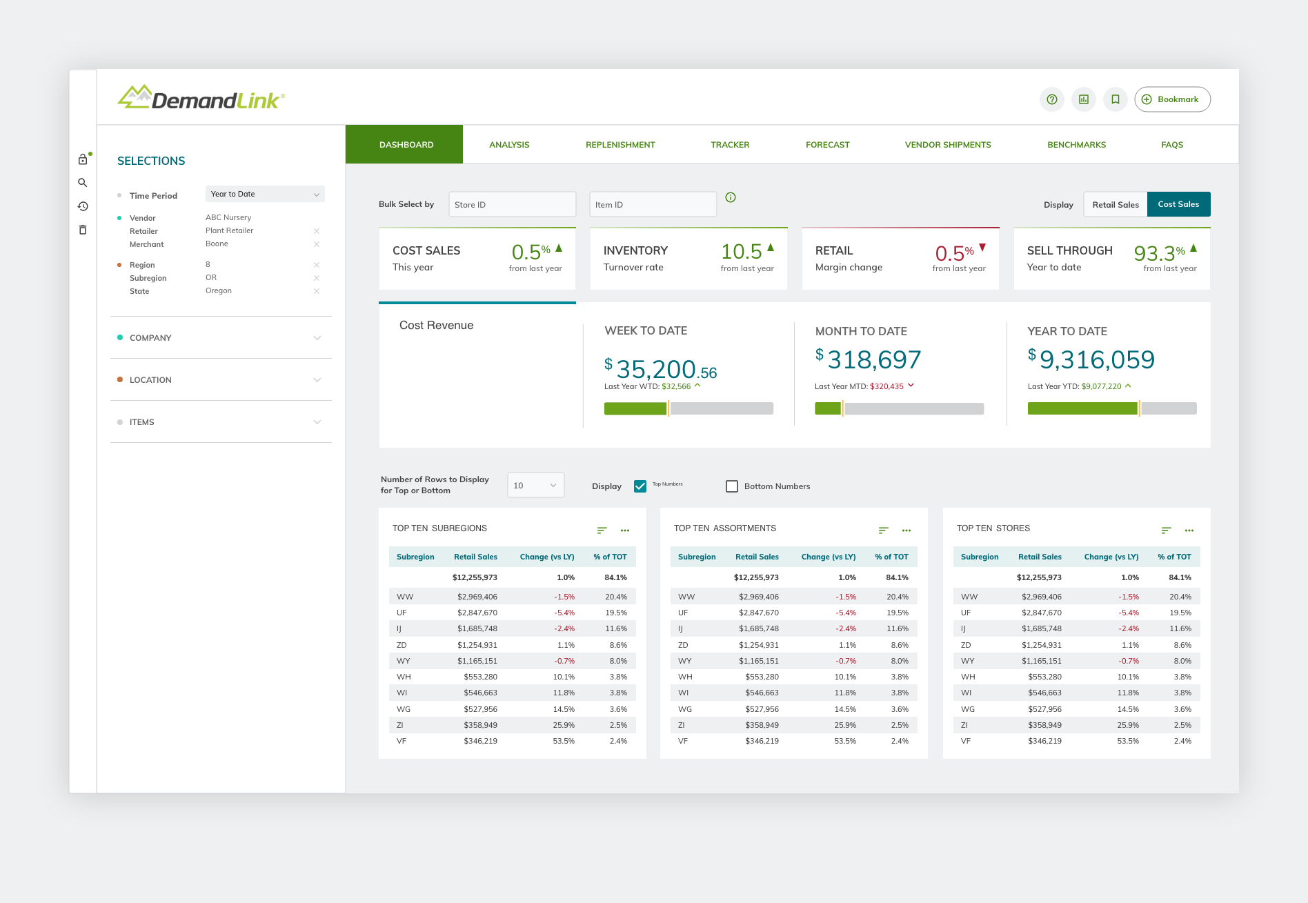
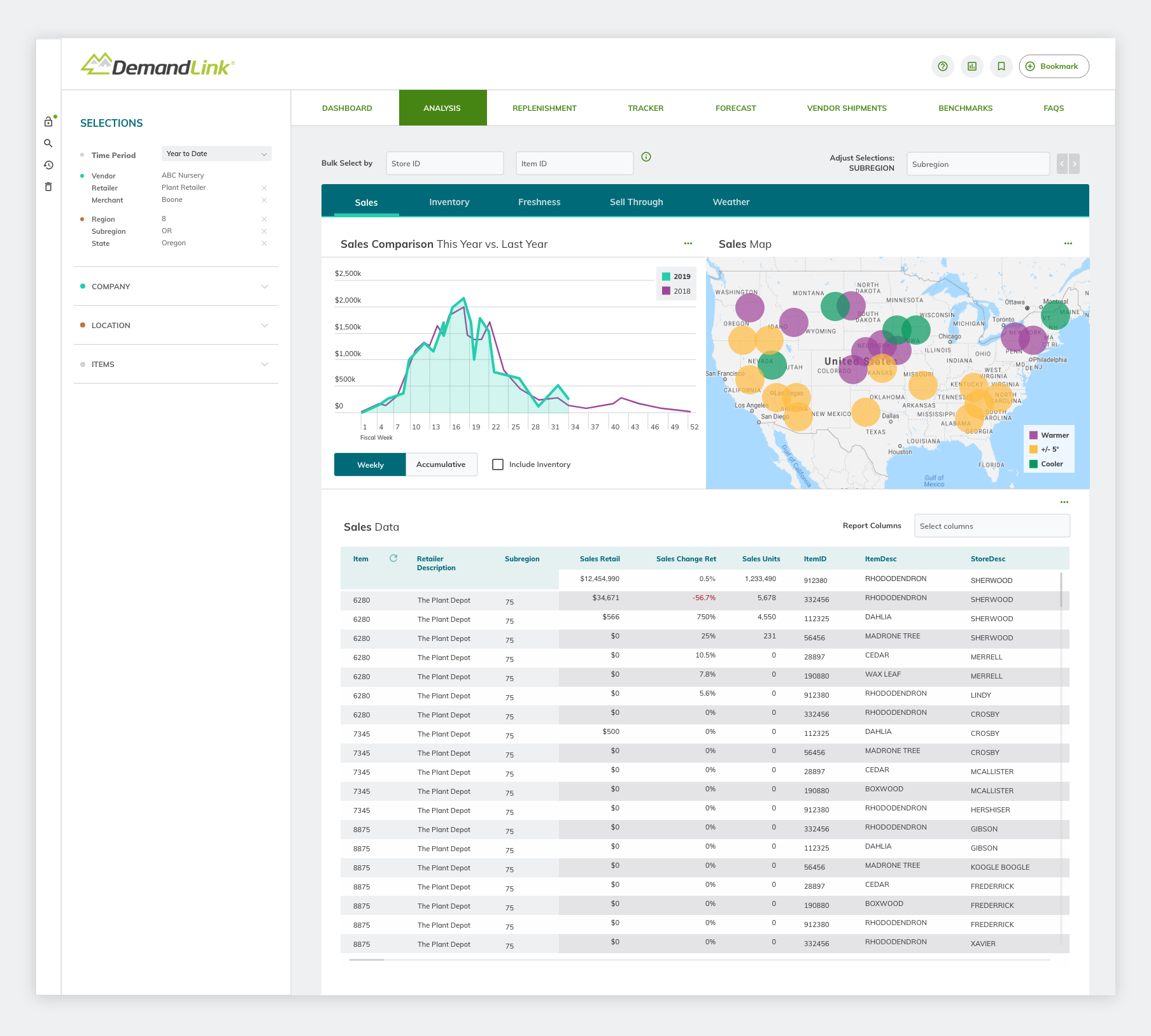
In order to apply best practices for this reskin project, we knew it was important to set a proper foundation before getting ahead of ourselves on any visual design changes. Given the drab, outdated, and otherwise dull appearance of the existing dashboard, we thought it was important to align with the client on any brand styles that would carry over to the new product, as well as provide our recommendations on updated color palettes and typographic choices. With the nature of the project being a visual reskin, we knew our selections for color and type were the most important tool we had at our disposal.
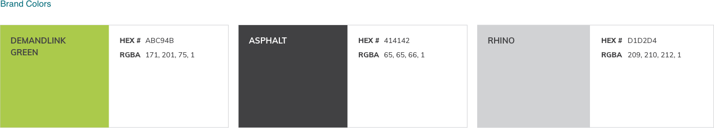
DemandLink had two main criteria when it came to colors: make it feel modern, and avoid color palettes used by the competition of their biggest clients. We kept this in mind and paired it with our approach of an improved user experience through consistent and intentional use of color.
DemandLink Brand colors were selected to be used only in specific instances where the color represented a direct association with the DemandLink brand or logo, such as color bar identifiers or indicators. We opted to leverage the core brand colors, green and gray, as much as possible while adding four additional categories beyond brand colors.
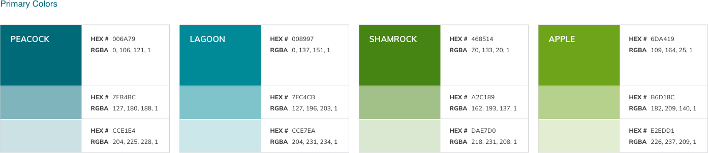
The primary color palette was created to be used for all buttons, links, and calls to action. This applied to text links, clickable icons, and any other clickable item. Since the existing dashboard relied too heavily on green and gray, we introduced blue hues into the palette that would play nicely in the cool palette we were working with and avoid feeling off-brand.
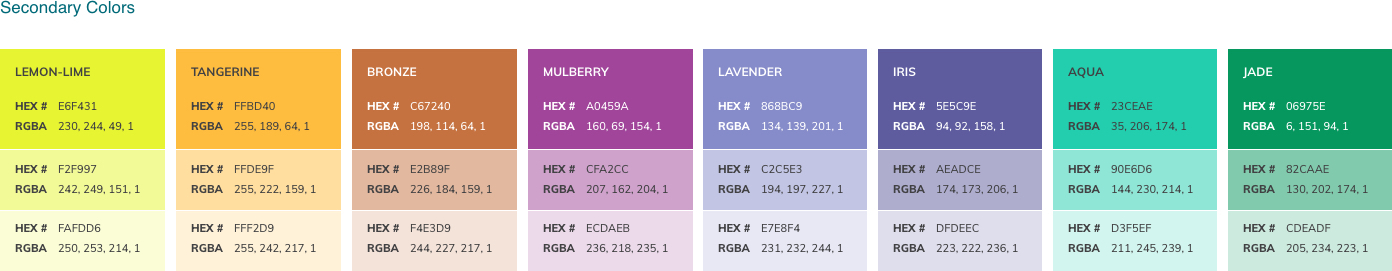
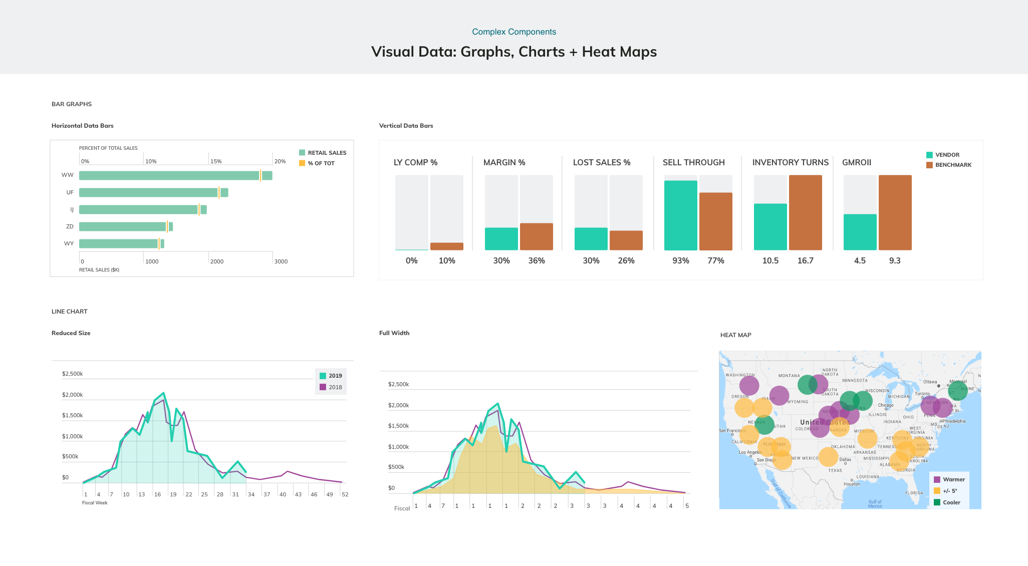
The secondary color palette was designed to be used only for visual data graphics and as section color indicators. In order to keep a strong visual hierarchy, these colors were never intended to be used for headers, links, or buttons. Providing DemandLink with a color palette specifically for use with data visualization helped create a less confusing experience for users since they wouldn't be tempted to mix and match colors that were intended for structural UI components into their key data visualizations.
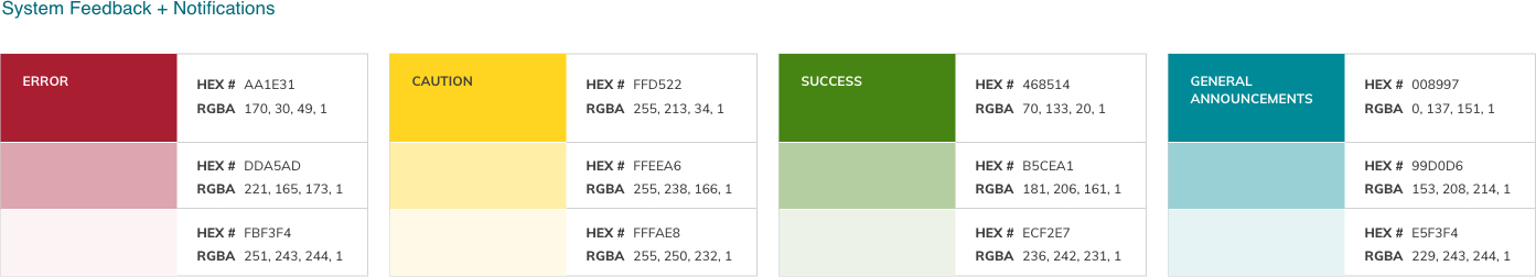
The color palette that was developed for system feedback and notifications was intended to draw the eye and create clarity. The variety provided in this palette can be used to visually notify the user that there has been an error or to warn them that their action may cause unexpected results (e.g., deleting items permanently, invalid information, etc.). It was important to create a dedicated palette for system feedback to further reduce the risk of confusing users if colors intended for other purposes appeared in the wrong context.
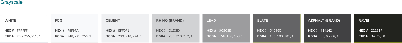
Lastly, we put together a grayscale palette to give us the flexibility needed to round out any additional use cases of applying color such as backgrounds, pipes, icons, and other important structural pieces of the dashboard where it made more sense to avoid a saturated color.
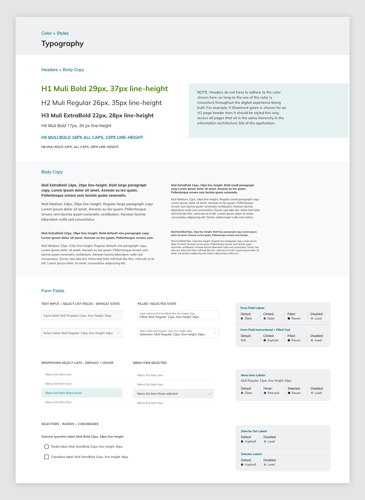
In addition to the refreshed color palette, we wanted to give a fresh look to the typography used across the dashboard. The client wanted a new, modern look so we opted to use Muli, a free and open-source Google Font for legibility, quick loading speeds, and universal support across browsers. Due to the fact that we were simply providing a reskin, and not a complete redesign, every item had to be taken out of context and given rules. This allowed the internal development team at DemandLink to take these rules and apply them across the dashboard wherever it was necessary.
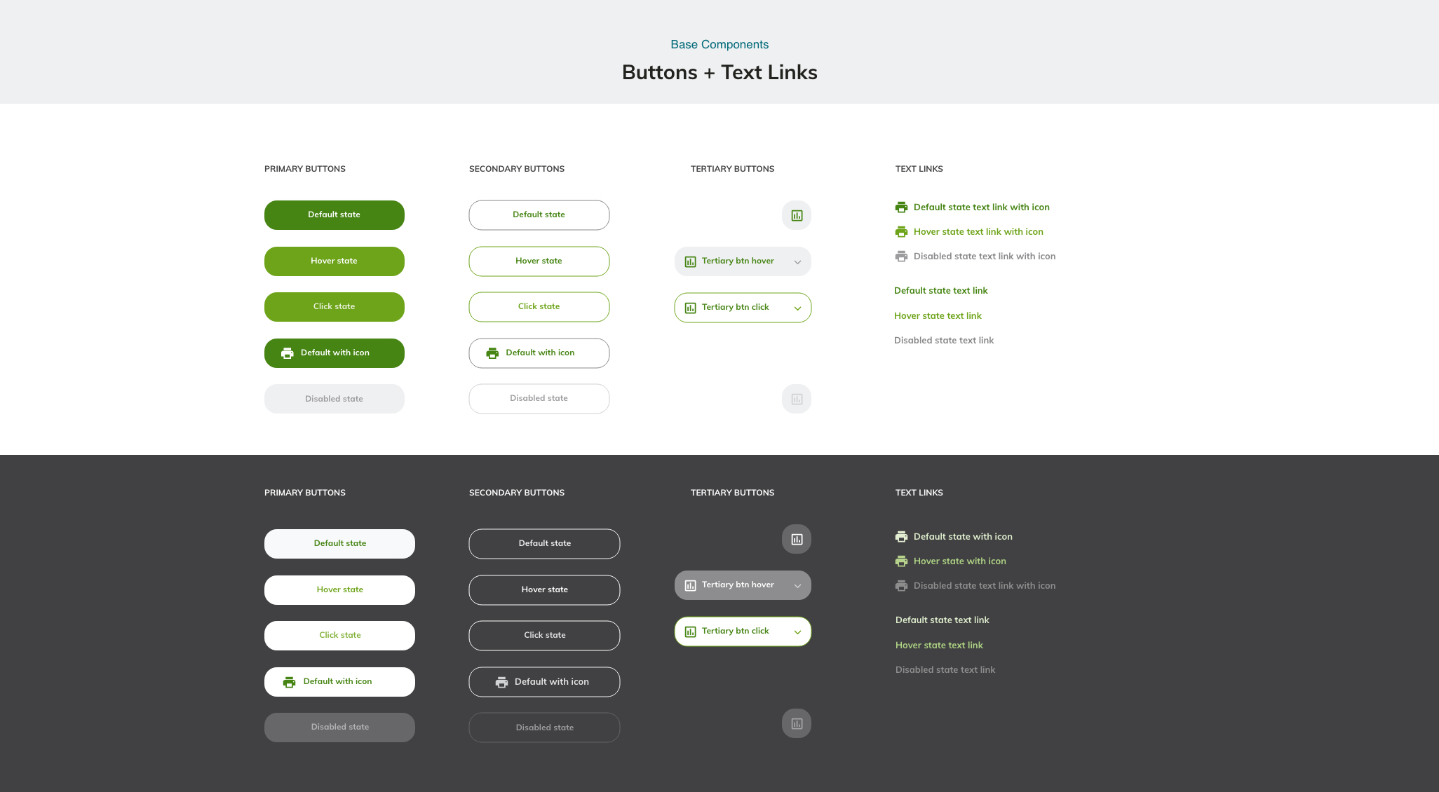
Once we had colors and fonts locked down, we worked with our UX Strategist to take an audit of all existing components in the dashboard and prioritize them into three groups. This step of the project was extremely helpful to identify the total number of components being used, and ultimately where we needed to focus our design efforts. This level of detail also ensured that DemandLink's team knew what they would receive out of the design and how we conceptualized each group of components, their usage, and priority.
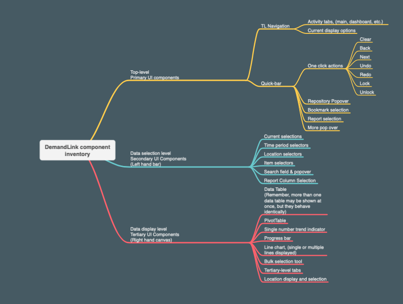
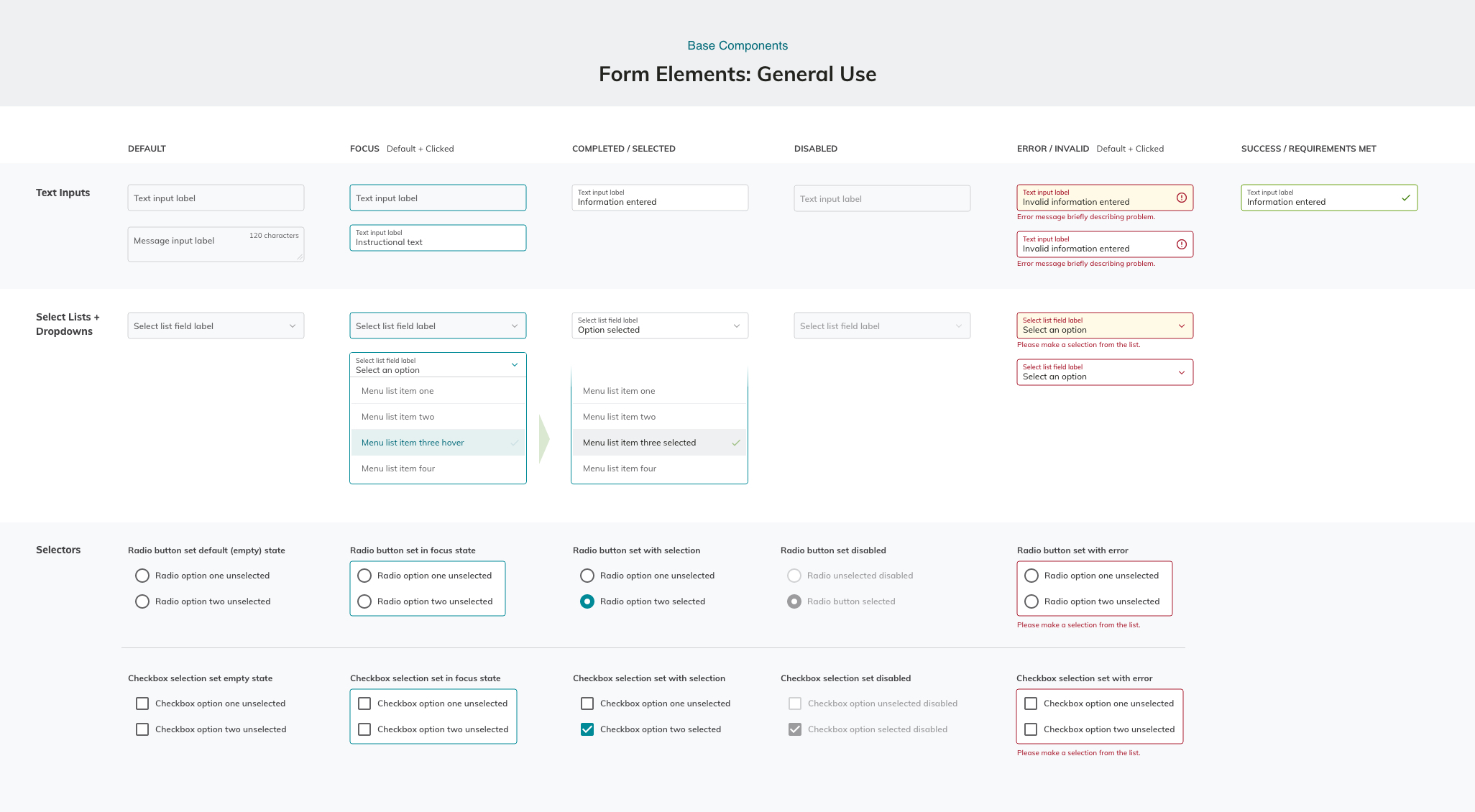
The images show below give a snapshot into the amount of components we reskinned, in addition to the multiple states each component would react to such as hover, clicked, selected, disabled, invalid, success, and more.
Since DDD is a company that generally does all development in-house, this project was a fun challenge for our design team to work in partnership with the client's development team in order to get what they needed. By the end of the project, both our team and the client were very satisfied with the result of the dashboard reskin.