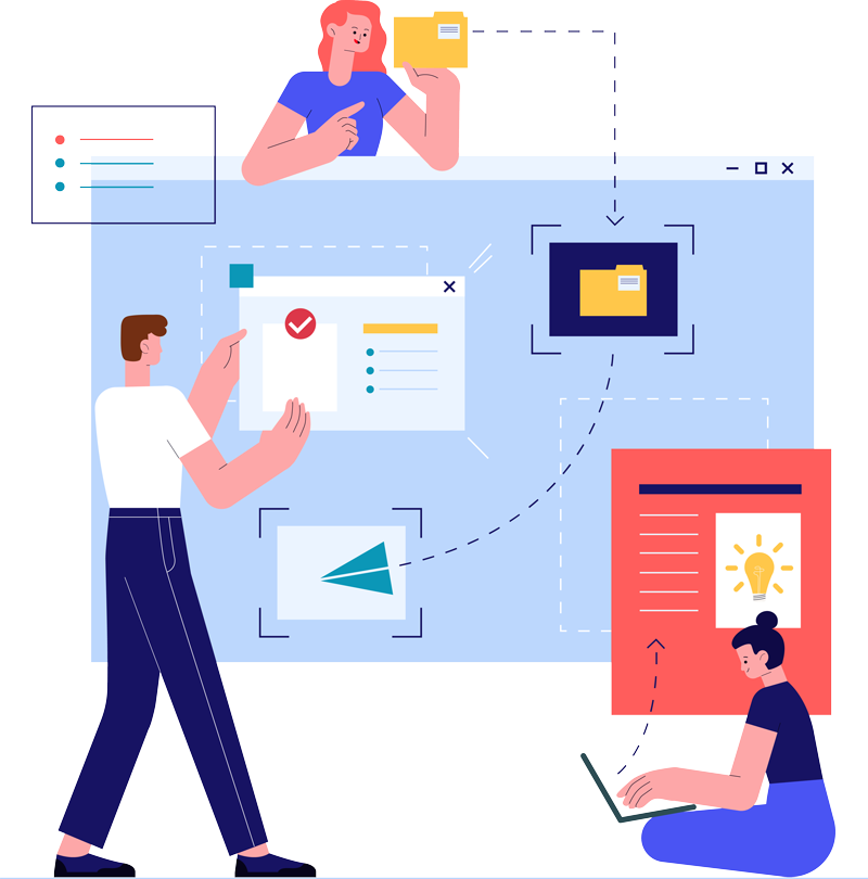
“I’ll know it when I see it” is a phrase that many of us have heard, especially when talking about good design. The funny thing about user interface (UI) design is that if it’s done well, you don’t see it. Good design becomes an extension of you. When applied to websites or apps, a good UI allows the user to feel like they’re in command. It encourages them to explore and rewards them with intuitive and satisfying experiences. For those reasons and more, having a seamless UI is a crucial part of any app’s or website’s success as a business tool. This article explores the three most important UI design principles that your business should address. Incorporating them into your website will drive sales and click-through rates by providing your customers with a hassle-free and engaging digital environment.

The Three Main Principles of User Interface Design
Be Accommodating- Allow Users to Undo Their Mistakes
At some point, you’ve probably felt the queasiness of sending or deleting something you didn’t mean to. This can easily happen if you’re cleaning up your email, especially if you’ve got a few important correspondences peppered in among messages that you’re trying to get rid of quickly. Not so long ago, you’d be up the proverbial creek if you made a mistake when using your email, but things have changed. Now, thankfully, we have the option to undo our gaffes.

Your users should have the option to correct any action that they didn’t mean to do, like accidentally deleting a message or transaction. This helps your users feel a lot more confident and comfortable when they’re using your app or website. By reducing or eliminating their anxiety about making mistakes, users are far more likely to explore and try new things. On the flip side, if your users have to be overly conscientious about every action they take on your site, they’ll be far less likely to explore. Fear of making mistakes leads to increased anxiety about using your service in general, which is not good for anyone.
Be Informative - Give Feedback About On-Screen Actions
Have you ever experienced the anxiety of making an online purchase, but not knowing if the transaction was processed? Imagine buying tickets online for a flight. It can be an expensive and time-sensitive purchase. Not providing any feedback during the checkout process (or any other part of the transaction, for that matter) leaves users with a whole bunch of unanswered questions. With poor feedback, they might ask themselves, “Was the purchase approved or declined? Will I have to start the process over again? Will I be charged twice if I hit ‘buy’ again?” And so on. After an experience like that, chances are they won’t be using the same service again.
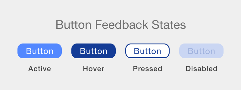
Providing user feedback goes a long way towards making your users comfortable. It lets them know that their actions have been acknowledged and confirms the status of their tasks. User feedback should correspond with the importance and frequency of the action it’s reacting to. For common actions, the feedback should be small and simple. Buttons, for example, are a good candidate for this kind of feedback. A common UI pattern for buttons uses “states'' (sometimes called “feedback states”). This means that a button will visually change if it’s interacted with. For example, its color will change after it’s pressed to indicate that the action - the pressing of the button - has been acknowledged. Without this kind of feedback, users are left wondering or have to check to confirm that their actions have been carried out as expected.

In recent years, feedback has gotten more sophisticated with the use of animated microinteractions. These animations quickly provide feedback on a small number of actions and add visual interest to your app or site. Here are some examples of micro interactions from our own site that let the user know that the element they’re hovering over has a function and has been activated. We’ve kept these animations intentionally simple, so visitors to our site don't get distracted from their tasks. This kind of feedback is visually engaging and rewards the user with real time feedback. If you’re looking to learn more about microinteractions, take a peek at this article we wrote. It provides a more in-depth look at the evolution and application of animated microinteractions and explains why they’re a must-have feature for any app or website.
Reduce Noise - Eliminate Unnecessary On-Screen Elements
The user interface for your app or website should aim to get rid of any on-screen elements that are rarely or never used, like a button that doesn’t function. Useless information clutters up the screen and distracts your users from the task they’re trying to complete. These visual interruptions lessen the impact and value of the critical elements on the screen. It’s like the saying goes, “If everything is important, then nothing is.”
A surefire way to streamline your UI is to remove any element that doesn’t explicitly support your user’s goals. This can be done in two steps. First, establish the task that your user is trying to complete. Then, take a visual inventory of everything on screen and ask yourself, “how does this help someone complete their task?” If it doesn’t directly help, get rid of it. Decluttering your interface will make it easier, quicker, and more satisfying for your audience to use your site.
Summary
These are the three main steps you can take to give your users a consistently positive experience while engaging with your app or website. You should strive to promote clarity in your UI, and look for ways to improve user confidence when navigating through your site. Without the fear of accidental errors or unintended setbacks, users are encouraged to explore and return to your site. The internet is constantly evolving and allowing for new expressive capabilities. Our demand for intuitive and gratifying experiences will remain the same, however. Good UI delivers just that.
