Technology:
Craft CMS
HTML5 / SCSS
Bootstrap 4

Project:
Upon publishing his new insurance textbook, insurance agent Jeffrey McIntosh looked to Data Driven Design to provide a simple website with a clean design that promoted his work.
Craft CMS
HTML5 / SCSS
Bootstrap 4
Design
Frontend Development
Backend Development
Project Management
DevOps
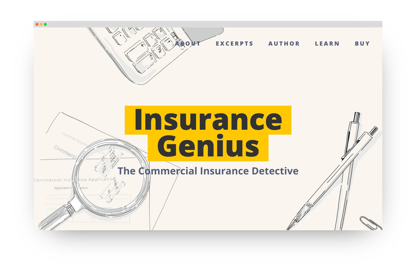
The goal of the new website was to provide some excerpts from the book, information about the author, where the textbook has been adopted for use and where to purchase it. With a select area of expertise, creating a single-page website would provide the perfect format for the publication. Although the website itself was straight forward and for a particular audience, the aim was to make it anything but boring
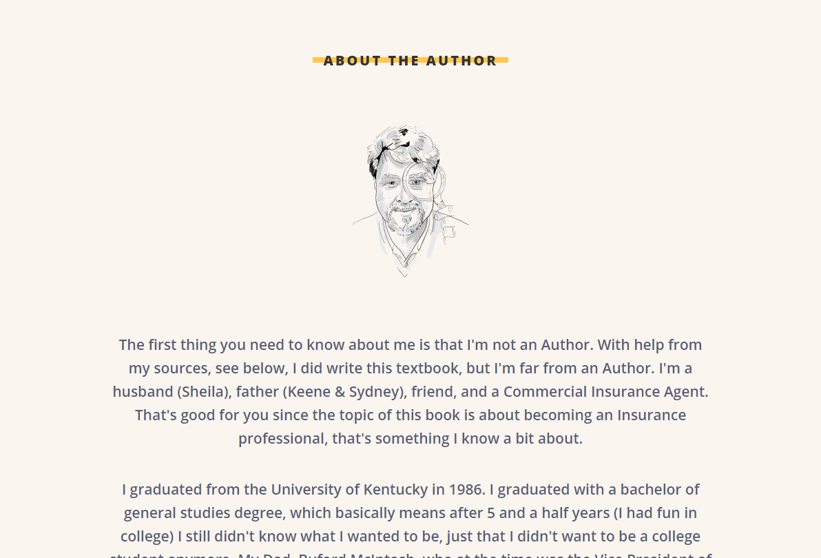
We started developing the concept for the website after taking a look at the illustrations. The client had commissioned an artist to create illustrations for this work and these had been provided to us. They helped drive the creative approach and felt very much aligned with the hand-drawn, handheld overall style that we developed.
Given that this microsite was for a textbook, we opted to give it a visual aesthetic that embodies the look and feel of holding a book in your hands. Therefore the background of the site is a slightly warmer gray/beige tone – such as the paper pages in a book, rather than stark white. This not only gave the site a more wholesome appearance, but is also easier on the eyes for those who come to the site as a resource to read the excerpts.
We also incorporated a "highlighter" effect over key titles and headers, as a nod to the future students who would be studying the text and marking notable sections. The color of highlighter is slightly more subtle and rooted in soothing earth tones versus traditional neon yellow thus feeling more familied with the background color.
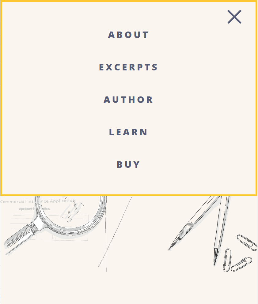
Although the simplicity of the single page approach of the site was central to the design, we wanted to ensure that visitors could easily find exactly what they were looking for without needing to scroll to find it. Since many of the sections allowed for additional content entry, we knew the page length might get significantly longer with updates added over time. While the website's navigation pattern is one that should be familiar to anyone who uses the internet, we incorporated anchored links to the different sections as opposed to separate pages. So, with a single click, a visitor can be taken down the page to the info they need.
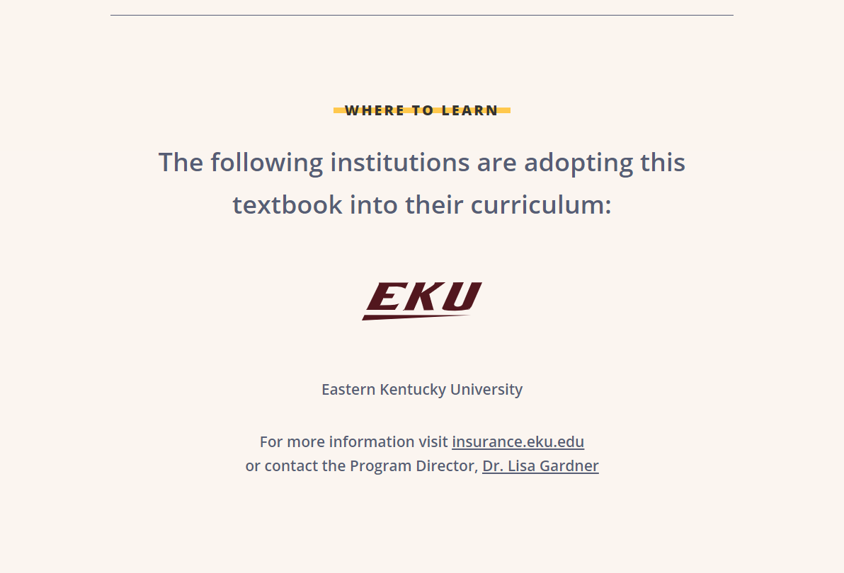
In order to set up straightforward, easy content entry, we customized the backend of the website to make it simple to add to over time. For example, in the Where to Learn section, we provided a spot to easily add details as the textbook is adopted by additional institutions and courses.
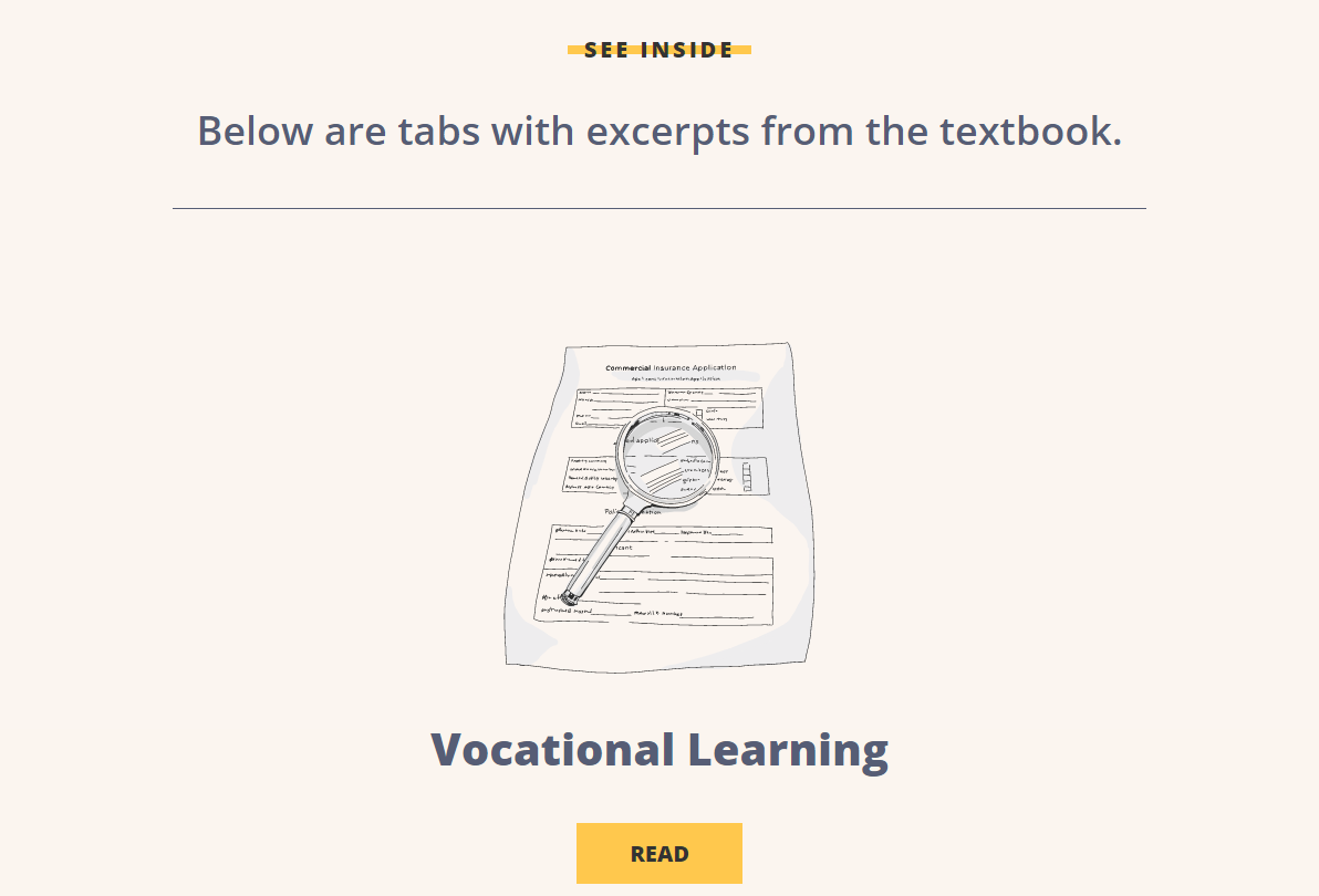
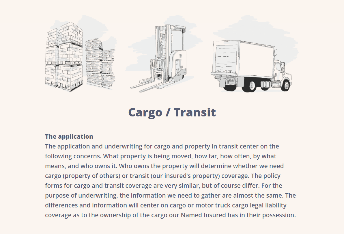
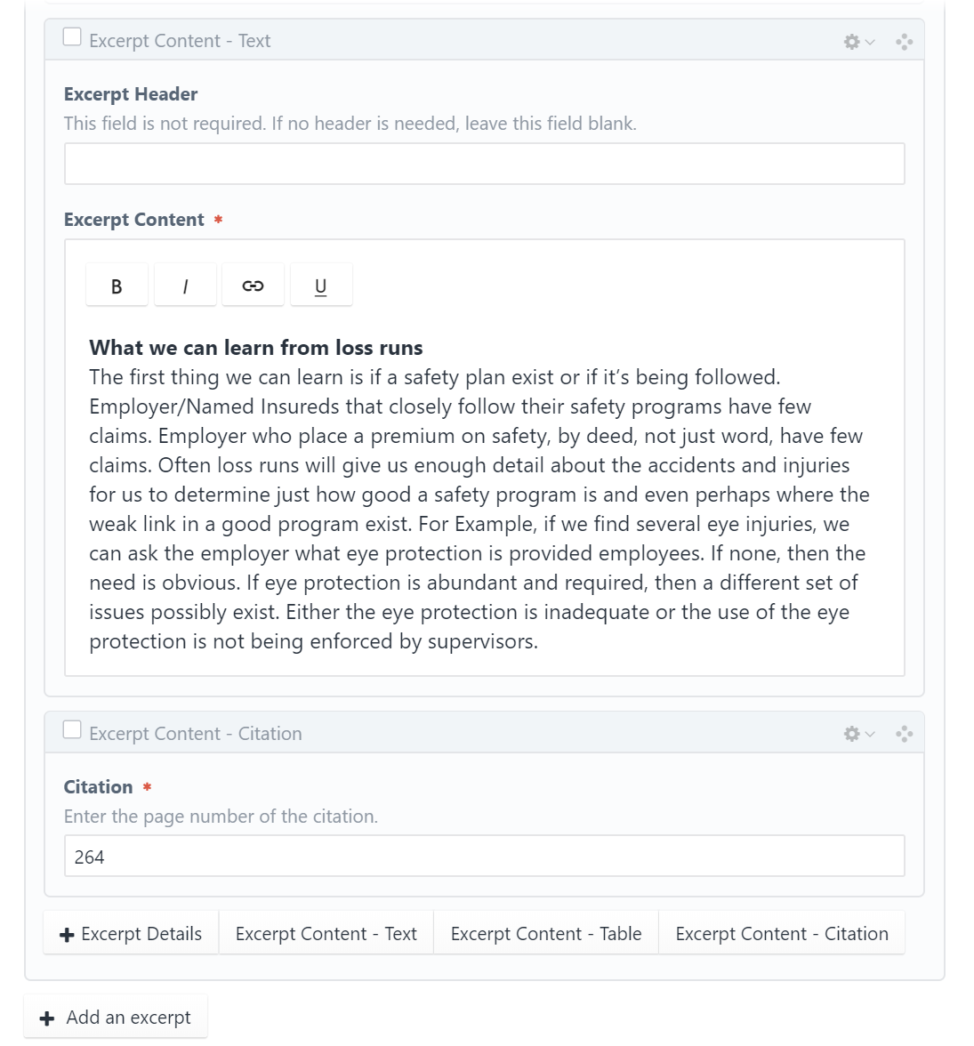
In the expandable excerpt section, we made it easy to define a new excerpt but also provided multiple options for the content entry within the excerpt. The details can be added (image, title) as well as a text excerpt, citation, or table to display information. All of these options can also be reordered, which results in the excerpt sections being able to be individually customized.
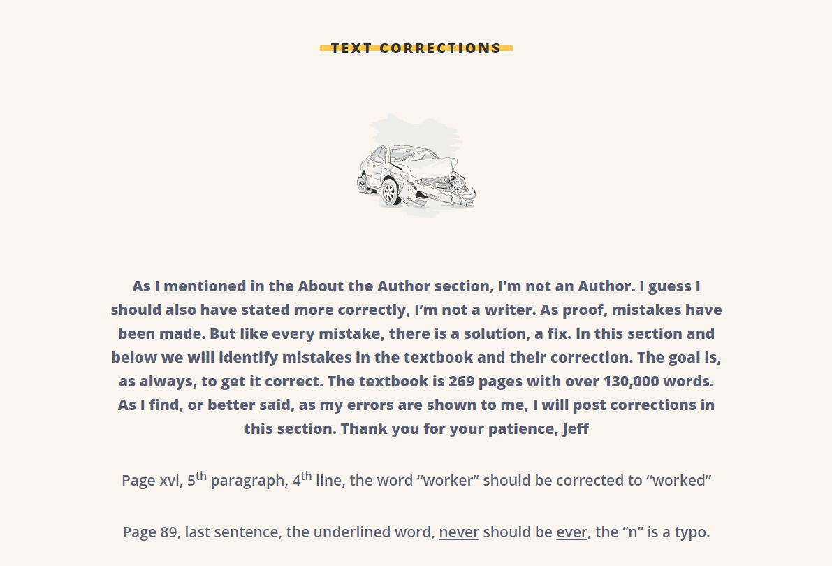
Since creating the website, we've continued to make updates. We recently added an additional section for corrections to the book, as well as a place to list the author's industry awards.
