Project:

Logo Refresh

scroll icon
Kind Project brand logo

Small Project, Big Mission

When KindProject.org needed a logo refresh they reached out to Data Driven Design to make it happen.

We helped retain the legacy of their original mark by incorporating a heart into their lettermark while updating and modernizing their colors and type to allow for optimized use across printed and digital materials.

Kind Project - Branding guidelines for logo, typography and colors

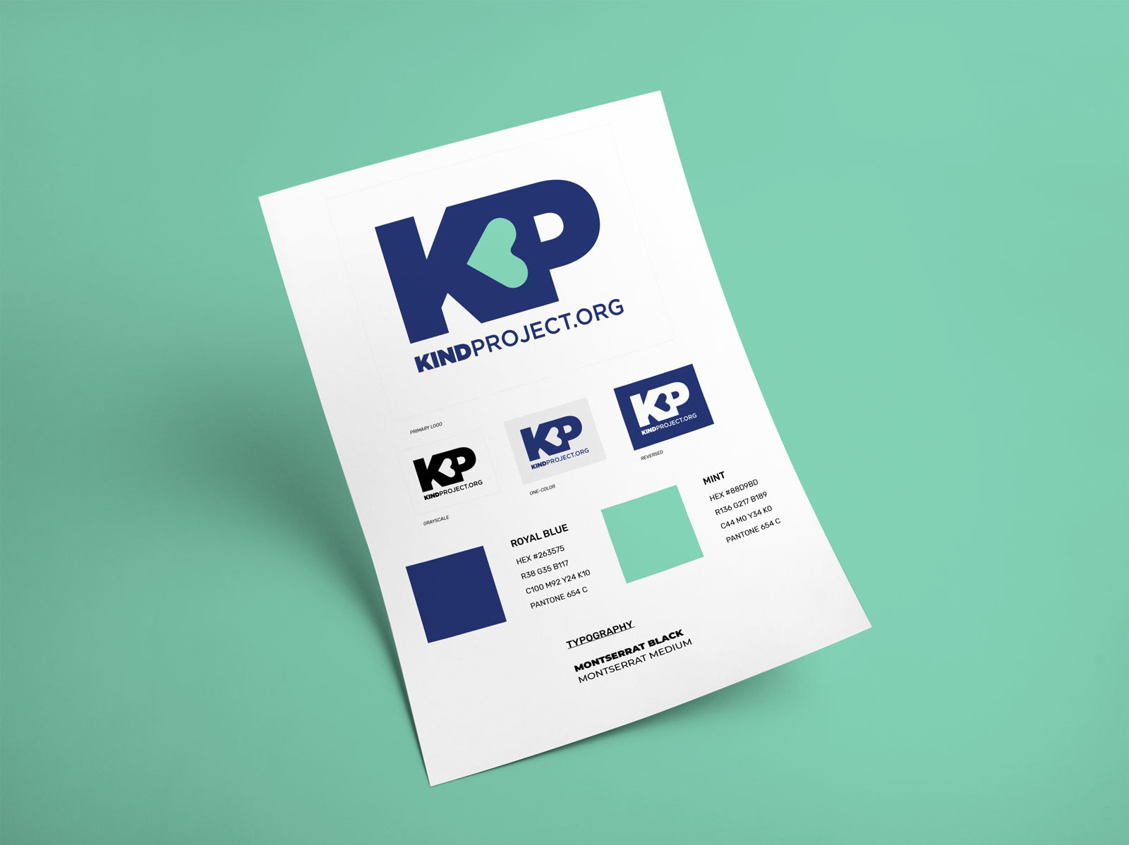
Style Guideline for clean and clear use

We assembled the KindProject.org logo suite, color palette, and typography into a style guideline document as a quick reference for the founder to utilize his brand assets. As an emerging organization leveraging a network of contacts and companies to lift it off the ground, he needed a straightforward one-page document that he could share with sponsors, event staff, and social media ambassadors to ensure everyone would know how to best showcase the brand.

Kind Project - Brand logo design iterations

Logo Iterations

We originally explored recreating the core brand mark for KindProject.org, including several iterations that leaned on emphasizing the word Kind, as well as incorporating the heart graphic throughout the mark. The client enjoyed seeing a wide range of brand marks but eventually decided to lean into an optimization of their original idea using K+P in combination with a centralized heart.

Kind Project branding logo - Color options

The Right Kind of Color

One of the requests we received from the client was to display the new brandmark in a large variety of eye-catching color combinations. Offering this many different color combinations is outside our normal process, but the client responded well to the variety of options to choose from as he was still defining the overall tone and energy of the organization and this gave him a great exercise in working to shape that.

Kind Project - Brand logo texture design iterations

Design Recommendations

An original direction that the client requested to explore was the use of a pattern or texture located within the center of the heart. After exploring a variety of pattern options for him, we ultimately recommended keeping the heart graphic as simple as possible to avoid any clutter or distracting elements.

We also advocated for this shift due to the common use cases he described, such as in the corner of images on social media posts and email signatures. With the logo being so small in these situations, the texture wouldn't be easily visible. Once we discussed this together, he was open to exploring other options which ultimately lead to the final design we landed on.

Need to update your logo?
We want to help.
Let's Work Together
Graphic Design - branding identity logo