Development details transform the design
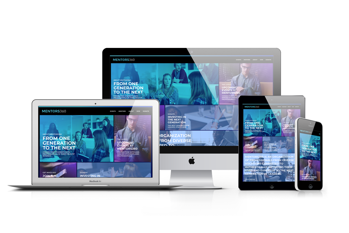
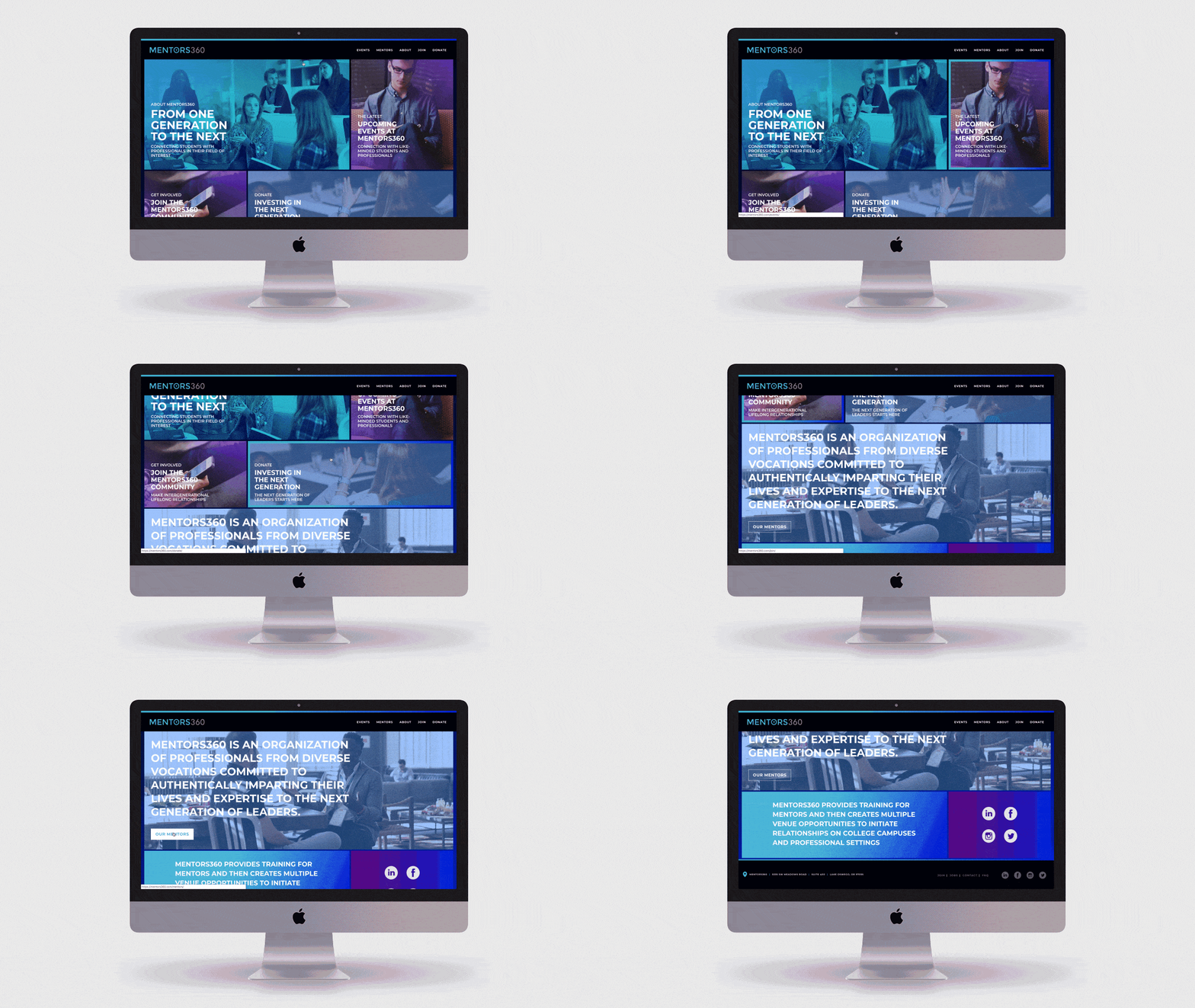
The design for Mentors360 called for entirely unique pages, each with their own underlying design concept. The home page of the site has a strong visual impact, with images incorporated to drive users to specific parts of the site. Hovering over the linked images reveals a gradient border in complementary blues and purples, a quirky application of style for a simple action.
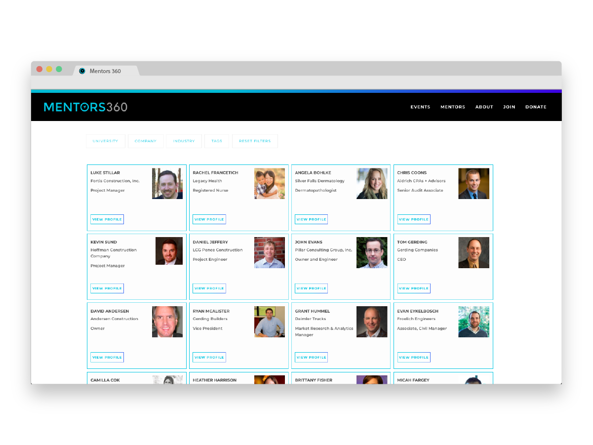
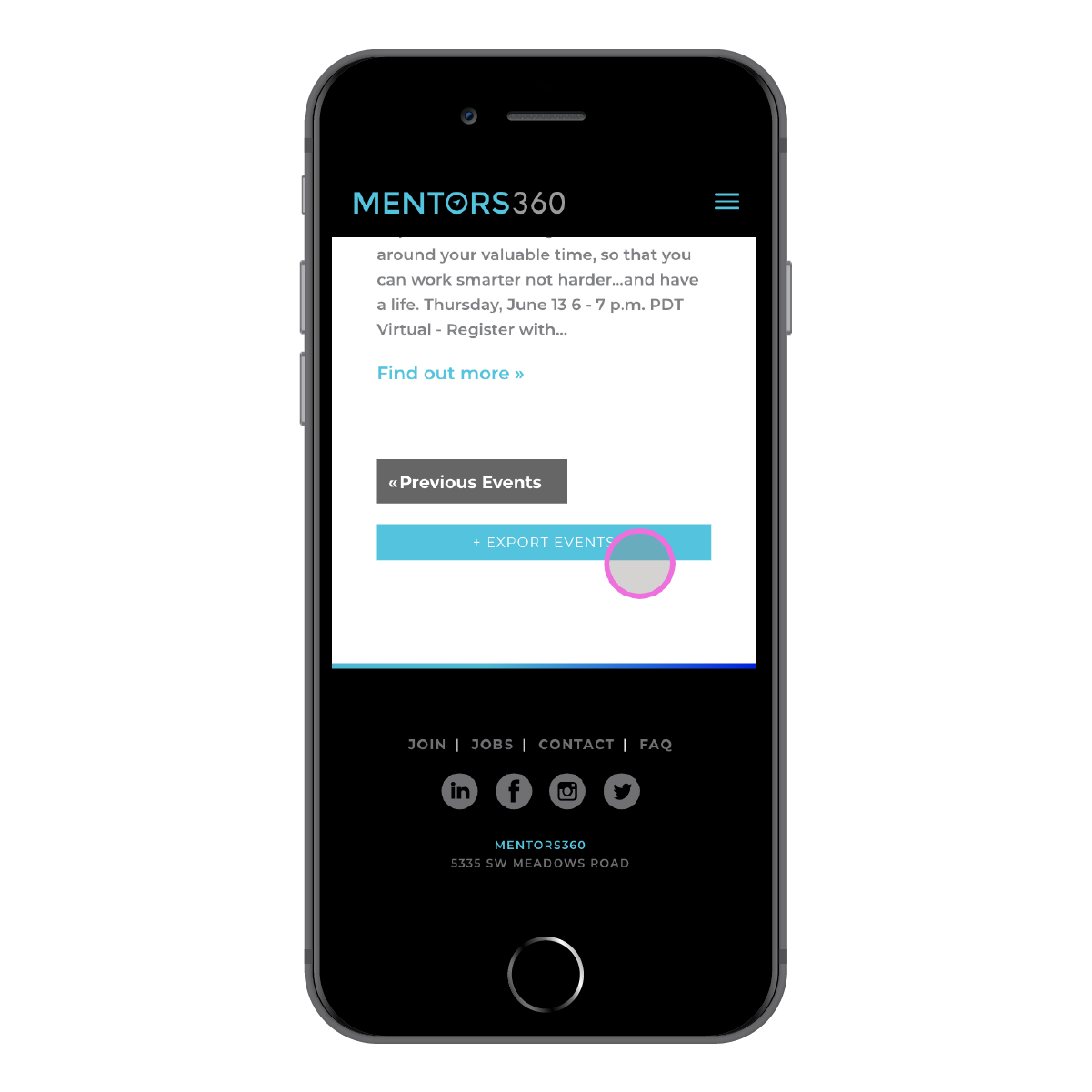
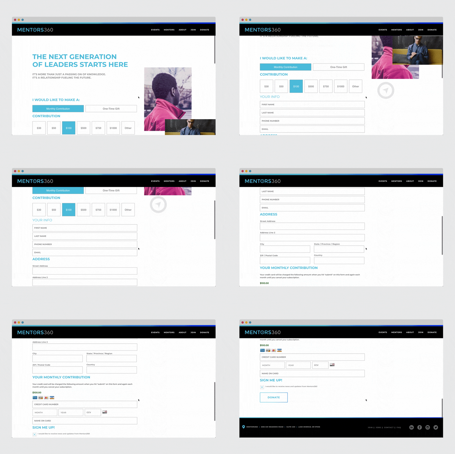
In contrast, many of the other pages of the site have a more streamlined look. The Events listing page and the Join page are instead focused on keeping the user on track, conveying information in a straight-forward and traditional style. Despite the simplicity of these pages, gentle loading effects and parallaxing images add unique elements to provide a polished look.

