Data Driven Design icon

How to Use Google Optimize to A/B Test Your Website: Part 1

Why A/B test a website?

Many successful small to medium-sized companies know who their audience is through the daily work and interaction their team has with those they serve. Whether their target market is individuals or businesses, this contact allows companies to know their consumers without having to interview each one on the details of their life, goals and purchasing decisions. Out of these relationships naturally comes a level of intuition about what people like and dislike and why they chose you over other companies.

Companies of this size likely have a customer-facing website and, if they're lucky, marketing and sales teams that are constantly getting feedback from their consumers. So, when it's time to make changes to the website there are probably several factors and multiple ideas about what might work. But how do you objectively know what's best when you have two or more strong ideas? Or, what if you think you do know which is best, but it's actually not? This is where A/B testing can help you gather the data to be confident in the choices you make to refine your online experience.

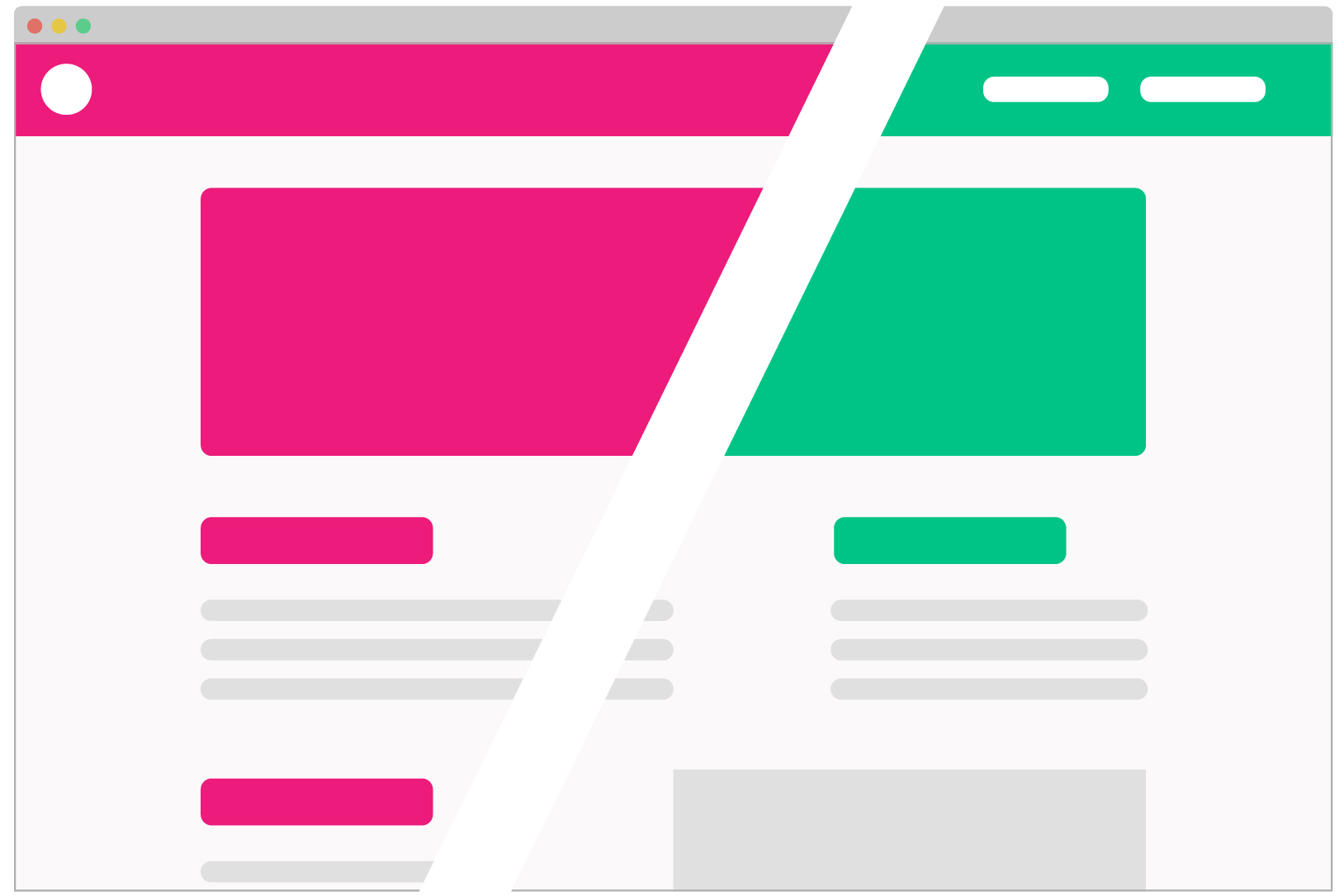
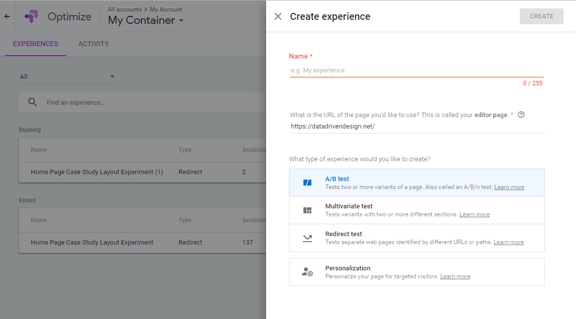
So, what is A/B testing?

A/B testing (also known as split testing) explicitly sets out to determine which version of a webpage is preferred by your users. In this type of test, users are randomly assigned to see a single version of a webpage and the testing framework then measures the actions taken by the user to see whether they meet your stated goal. Statistical analysis is applied to determine which variation performs best, giving your intuition a thumbs up, and you the confidence to make the right call based on your goals.

How to Use Google Optimize to A/B Test Your Website: Part 1 - A/B Test image browser

Testing services options

There are many platforms to help with gathering data on how users really use your site. Many of these platforms specifically have A/B testing to help collect data on which of the variants is best. Teams at larger companies routinely use these tools and others to determine which options lead to desired outcomes, such as increased sales volume or average order value, desired purchasing of an up-sell item or contacts coming from the company's website.

Google Optimize is one of these services, which we'd recommend over others especially if you're already using Google Analytics to gather data on your site. Google's system is fairly intuitive and there's a whole load of documentation about Optimize in their help center to support users. Additionally, Google Analytics users will be more familiar with the Optimize interface, making it simple for tech-savvy marketing teams and owners to access data easily.

How to Use Google Optimize to A/B Test Your Website - AB Test Google Optimize Browser

Before you set up a basic test...

In order to set up your test, you need to start by:

  1. Having a defined goal (i.e. get users to go to a specific page or click a specific button)
  2. Have at least 2 version ideas ready to try out. The first should be the original page. The second (variant) should be a page with minimal changes to support your goal. Depending on what you're changing you may need to set up a traditional A/B test or a Redirect test.

An important note here: You typically don't want your control (original) and test variation to differ in huge ways, with multiple different elements. For example, if you change the page's color styles, layout (order of elements or sections) and content (text), it'll be hard to know what part of the preferred version users are responding to because they're simultaneously responding to so many. Is your call to action better in one? Is the color easier to read in the other? You won't be able to definitively identify what makes one more successful.

Google Optimize Experiment Set Up Image

Test set-up

  1. Log in to Google Optimize
  2. Click on a container and then select "Create Experience."
  3. Type in a name for your test
  4. Determine whether you need to set up an A/B Test or a Redirect test. A/B tests are best suited for simple CSS changes such as button color. Google Optimize's dashboard will allow you to make these small tweaks within their system, so you just need to have your testing goal defined and your original page. A Redirect test requires 2 separate pages with individual URLs. This is for more significant HTML changes - such as the example of our test below - one version with a carousel and the other without.
  5. Click Create and walk through the additional steps to set up the variants and weighting (you'll usually want to start with equal weighting across the number of variants). Make sure you're looking for a minimum number of sessions to provide statistically significant data. For example, 25 sessions may show an early preference for one variant but those results would not be statistically significant, so you want to wait for more data to come in.
  6. Start the experiment
Google Optimize Redirect Carousel Case Study Experiment

Our test

We recently set up a new test in Google Optimize to see if there is a significant difference in conversions to our case studies depending on the layout of the section. Our team had been discussing how we could best utilize the space on our homepage and whether there was a better way. Our original was a long-form list of case studies that users could browse, and we wanted to see if people were then interested enough to look at the project details by clicking on a button that linked to each project.


But the design side of the team had originally wanted these case studies to be put in a carousel to minimize screen share. Out of a desire to get the MVP out of the door, we hadn't developed this functionality, and were now curious about which design was more effective. Here's our rough ideas about the pros and cons of each.

Long Form Version
  • Possible pros
    • Each case study is clearly visible on the page
    • Slightly quicker load time since no js is needed to make this function
    • Alternating layout - makes this section more interesting visually?
    • Gives an opportunity to see more images of work projects at once
  • Possible cons
    • Lots of scrolling for the user - especially on mobile
    • Not what the design team really wanted
Google Optimize Redirect AB Test Long Form Original
Carousel Version
  • Possible pros
    • Most case studies are tucked away - sense of mystery?
    • Screen share is smaller and makes it feel like this section doesn't dominate the page
    • Transition of slides creates movement and draws attention
    • Can show some personality with a custom timer (use project colors)
  • Possible cons
    • Does such a small change really make a difference? Should we put time into this?
    • If we want people to click on these, does showing one at a time cause less conversion?
    • js for a carousel makes the page load slightly slower
Google Optimize Redirect AB Test Carousel Variant

Because our question was around layout differences that required HTML changes, we made two separate pages in our CMS and then hooked them up in Google Optimize. We created a redirect test to figure out which of our two versions encouraged users to dive more deeply into the site and learn about some of our past and current work.

Google Optimize Redirect Carousel Case Study Experiment Data

Now we wait

We've checked out our conversion rates so far, but not too many people have interacted with our experiment so far. We expect the test to take a while to come to a statistically significant conclusion. We'll keep an eye on things and let you know how our test turns out in another upcoming post.