Data Driven Design icon

How to Use Google Optimize to A/B Test Your Website: Part 2

Note: This article is Part 2 in a series about using Google Optimize to run a basic A/B test in order to help inform decisions on your website. Check out how use your goals to set up the experiment in Part 1.

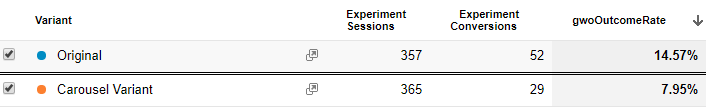
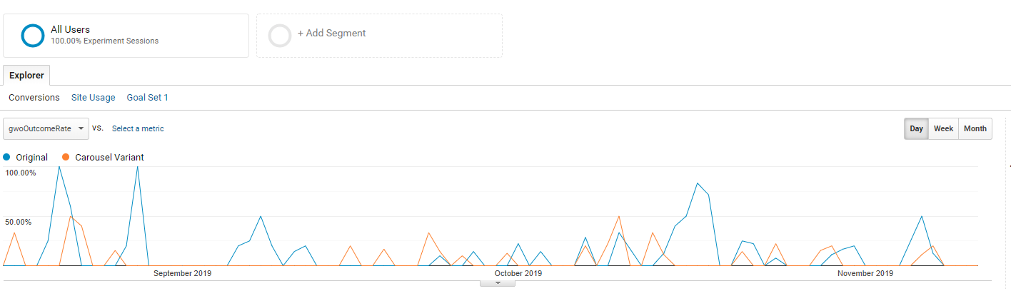
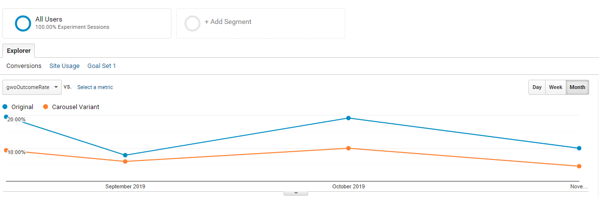
It's been a while since we first set up our experiment to test which version of Data Driven Design's home page resulted in a greater percentage of users traveling to our work section to check out our prior projects. Since then, we've waited as the data has come in, reviewed it and made a choice on which version we wanted to use moving forward. Let's go over how that played out so you can see how to use real data to make decisions about your own website.

Previously, during set-up...

You'll remember that we were careful that only one section of the homepage was set up differently between the two versions we tested. Those versions were (1) a long-form projects section and (2) a shorter rotating carousel of projects. In our experiment, we made sure to keep nearly all of the elements within the section the same. The same project image and excerpt were used, as well as the same accent colors for the "view" buttons that linked to the individual projects. We had lots of ideas about why one version could possibly be better than another, but little insight besides our own experience and brainstorming.

As a reminder, here's what the two versions looked like. The first is the long-form original:

Google Optimize Redirect AB Test Long Form Original

The second is the carousel variant we were testing as a new idea:

Google Optimize Redirect AB Test Carousel Variant

Wait for the Data

One of the hardest parts of setting up an experiment to test a new idea is being patient enough to let the experiment play out to a degree that you feel comfortable making a call based on the data. In order to ensure you're getting enough data, we'd recommend setting a minimum amount of time to let the test run, then reviewing the numbers. Checking in every day doesn't actually help the information get collected more quickly. We decided to check back in after a month and then decided to let it run even longer to get better data, but your timeframe might be different depending on the number of visitors to your site. In order to get a sense of what Google thinks, you can check out how they decide when to call an experiment here.

Take it all in

Google Optimize's Experiments are fairly easy to understand in just a few minutes of review. While there is a lot of information that you can drill down into, the two areas that are the most helpful to review are: (1) the section that provides some straight-forward numbers about the number of sessions, conversions and the outcome rate (% success) and (2) the graphs, which are great for visual people, to see overall trends quickly and are also handy for reports.

1. Straight-forward numbers

Once you do return to monitor the number, don't focus first on the percentages. If you haven't had enough visitors to a part of your site, this minimum amount of time may still not be enough. You need to look at the overall number of people who visited in order to determine whether the percentages matter yet. If only 15 people have visited your site and 10 of them were routed to your variant, your percentages might seem convincing, without having a high enough sample size. Check these numbers but let it run longer if you don't yet have enough data. Come back and review again if you need to.

Google Optimize Experiment Numbers Data Driven Design Homepage

Our Numbers

First, it's easy to see from these numbers that the number of experiment sessions is above 700, which is pretty good. Looking at the number of users who saw each version helps provide some confidence that the traffic was pretty evenly split. In our case, we had a difference of 8 users. 357 users saw the original long-form version while 365 saw the carousel variant. Remember, once a user is routed to one variation, if they come back to the site during the experiment, they will always be routed to the variation they originally saw. So we wouldn't necessarily expect the session numbers to exactly match.

After reviewing the overall number of users that saw your A/B test, you should then look at the Outcome Rate on the right side. This is essentially the conversion rate of each of the variants. In our case, the original, long-form version has a conversion of 14.57% while the carousel variant had a rate of 7.95%. In other words, the carousel variant resulted in a rate of ~54.5% (7.95/14.57) of the number of conversions compared to the original. Since this number is less than 100%, we know that it performs worse than the long-form version that was our baseline.

2. Graphs

We've found that using the Day, Week and Month settings to look at the information gives very different impressions, so you might find it helpful to look at all three. Here is a graph to show how the two versions performed over the experiment timeframe by day:

Google Optimize Experiment Graph Data Driven Design Homepage

Here it is by week:

Google Optimize Experiment Graph By Week Data Driven Design Homepage

And here it is by month:

Google Optimize Experiment Graph By Month Data Driven Design Homepage

These graphs help give you an idea of the overall performance and trends from your experiment. They are also helpful if you need to present information to your boss or a client. Our simple A/B test keeps this graph pretty clean as compared with some of the other types of experiments you can run in Google Optimize.

Outcomes

As a result of looking at the information, we stopped the experiment and began routing all users back to the homepage with the original long-form version of our case studies. Although our original was more successful than the variant, the key takeaway is to test your ideas to see which is the most effective in getting people where you want them to go. If we had not decided to measure the outcomes of this decision, it's possible we would have chosen to experiment without keeping track of our goals, and in the process have lost ~45% of existing conversions by rolling the dice on implementing the carousel variant.

We also feel pretty good about this result since it now allows us to move forward with additional knowledge. We can move on to further optimization on the home page or elsewhere with the goal of gradual accumulation of improvement across the site.

Need help developing a data-driven approach?
Get in touch